Port #22
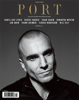
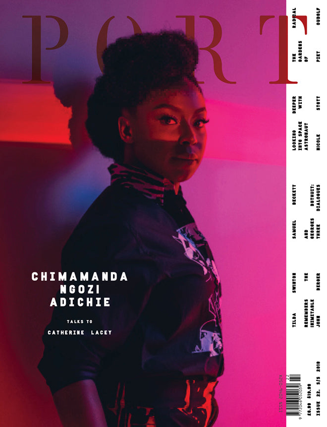
When you think of Port magazine, the front cover that probably comes to mind is a striking, black and white headshot of an older male actor accompanied by some stylish typography. The London-based biannual has broken from this mold on occasion but for their new issue they’ve made a more conscious move to shift perceptions. I caught up with editor Dan Crowe to find out more about the cover of their imminent 22nd issue.

The front cover of the launch issue of Port, March 2011
22 issues is some acheivement; what’s the secret of such long-term viability?
Magazines are a mysterious business. We try and make something unique, something compelling. We punch way above our weight in terms of who we work with, perhaps that has something to do with it: it makes the process ludicrous and exciting. I suppose getting the financial stuff right is important too, and that’s probably the hardest thing – we’re still learning how to do that.
There’s always a lot to improve on which motivates the team: trying to make the next issue better than the last is a constant focus. Magazines are as much about words and pictures as they are about people and ideas. When we get it right, like I feel we have pretty much with this issue, it’s something to be really proud of: like it’s a statement, a manifesto.
Why publish your first woman cover star now? Should we regard this as a significant shift, or a one-off?
We launched as ‘the magazine for men’, and, while we’ve dropped that tagline (as it started to seem quite militant), we initially ran with accomplished men on the cover who we felt were under-considered by our youth-obsessed media. After we had established our brand and made this point, we chose to exercise more freedom.
We had wanted to feature the novelist Chimamanda Adichie for a while, but it took a long time to arrange. We’ll be featuring more woman and a younger guy (now that we’ve bucked the trend) from time to time in the future. But we will always have time for the iconic men associated with classic Port covers.
Alongside that change, the whole character of the cover is warmer, brighter. Again, deliberately so?
Matt Willey (one of the co-founders of Port alongside Kuchar Swara and myself) came back to work with us on this issue, and we all wanted to shake things up a bit, remind ourselves that we’re independent and can do what the hell we like.
Matt drew a new font for the issue and looked after the cover and openers inside. Both editorially and design-wise, we wanted to do something different, while keeping the trademark Port tone and features.
Who shot the cover?
The cover was shot by Mamadi Doumbouya, an exciting young artist and photographer from Guinea, who lives in New York. We did the shoot in Washington DC, where Adichie lives. The colour was on set not in post-production; it was a bright and happy shoot!
Port has always had a changing creative team; where are we now? Who directed this issue?
The team changes but I’ve been editor from the start, and Kuchar has been creative director for 20 of our 22 issues. Matt Willey came back in as designer for this issue; Dan May is fashion director; Max Ferguson is photographic director; George Upton is deputy editor and I’m editor… That’s the senior bunch, a great little team. A wonderfully talented woman is joining us next month as fashion editor. We are a lucky lot.
We have contributors such as Tilda Swinton and Will Self in the issue, next to glorious fashion shoots in India, South Africa and the Netherlands, and a piece on rare citrus by the ex-director of Tate Modern next to works on deep space, the significance of pavements and the impossibility of art (by Samuel Beckett).
To have all this great content wrapped up inside a wonderful design bundle is exciting, and for me what it’s all about. Design alone is not enough. You need meaning and soul, and I hope that’s what we have achieved.
Follow Dan on twitter: @Dan_Crowe


