Sandwich #1
While the sandwich appears to be having a moment of reinvention, appearing in some of the smartest restaurants with the best ingredients and matching prices, the launch issue of Sandwich – the brainchild of a condiment manufacturer – celebrates the humble BLT.
Sir Kensington’s is a brand responsible for a plethora of ‘reimagined’ ketchups, mustards and mayonnaises – flavours ranging from avocado oil to sriracha. Though for a mag made to market a product, there are surprisingly few adverts. In fact, save for the massive green ad on the back page, I can’t actually find a single reference to Sir Kensington’s in the pages of the mag at all – this review has probably already referenced the brand more explicitly than Sandwich itself. This also means that the rest of the mag is refreshingly ad-free and full focus is situated on the order of the day: the BLT.

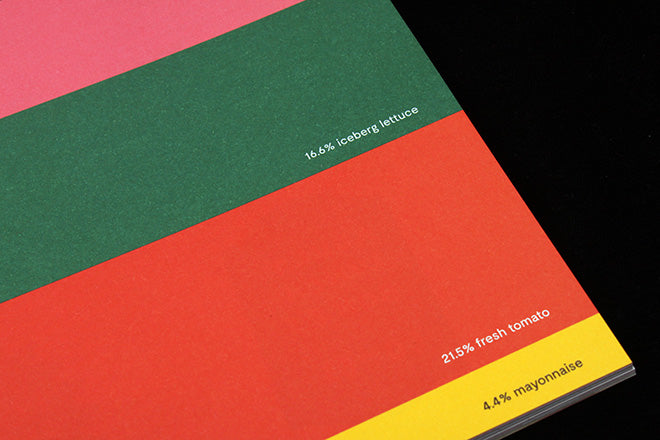
I love the colour-coordinated graphic on the opening page, detailing the exact numerical makeup of a BLT, right down to the decimal point. Mayo is the smallest proportion in this horizontal pie-chart, making up a humble 4.4% of the sandwich. Overall the illustration seems to depict a wildly generous portion size (14.8% crust?!), but considering the cover image features a photograph of possibly the largest BLT I’ve ever seen, it seems that this really is a Sandwich-endorsed serving size.


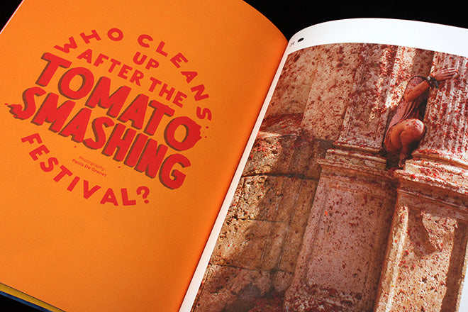
As one-third of the traditional BLT recipe, I’m glad to report that tomatoes receive the attention they deserve in this issue. A whopping 16 pages are dedicated to the ‘fruit’ and a glorious nine of those are photographs of La Tomatina, the spanish tomato-throwing festival held annually ‘entirely for entertainment purposes’. The story is titled ‘Who Cleans Up After the Tomato Smashing Festival?’, and Paola De Grenet’s weirdly satisfying photographs feature the purging that takes place after the event, rather than the predictable scenes of mushy combat.

Other unmissable stories include ‘what if we never stopped using lunchtime to express our passions?’, a feature on nostalgia for the lunchbox. A mini photo series of sandwich cases for adults features slogans that endorse your favourite author/director (Greta Gerwig, Jia Tolentino, Teju Cole, etc.), in the style of cartoon merch. The boxes manage to accomplish a lot: announcing that it’s not just actual food you possess: a sense of irony and cultural capital is also on the menu.

The editorial team behind Little White Lies have been enlisted to create Sandwich, which explains the brilliant use of illustration throughout; particularly Sarah Mazzetti’s oversized space-lettuce (above) and Annu Kipeläinen’s hand models, who balance bacon on outstretched fingers.
This is a mag of simple pleasures, done to a high standard. If it can keep up the momentum, I can’t see its popularity wavering anytime soon. And as for the perfect sandwich? According to the mag, it should be ‘hot, cold, sweet, sour, crunchy and soft.’
Editor: David Jenkins
Design director: Fabrizio Festa


