

Sean Perkins, designer
Today Sean Perkins of North design is sharing three of his favourite magazines from his shelf with us: a new one, an old one and a detail from a magazine that is particularly significant to him.
 North specialise in identities and branding, and they’ve worked with a number of high-profile clients including The Barbican, RAC, First Direct and The Royal Mint. Sean cites magazines as a constant source of visual inspiration for his studio, and he selects three publications that have been especially important for North.
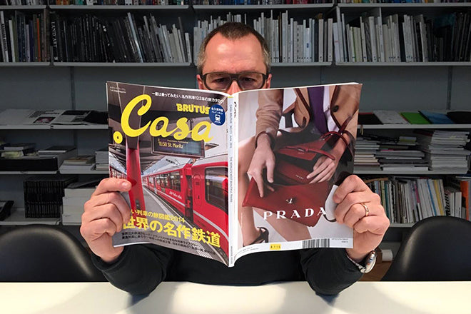
 New Issue: Casa Brutus
Casa Brutus is a Japanese magazine, and each monthly issue is themed something loosely related to design and architecture. It’s a fantastic reference tool for anyone in the design industry, a real visual feast.
 It’s difficult to find this magazine in the UK, though. I’ve been reading and collecting Casa Brutus for about 10 years as I find it an essential reference tool for my work. As with most good magazines, I find that every time I get hold of a new issue I’ve got a lot of anticipation and excitement – I never throw them away, and often keep them and read them several times before they get put on my reference shelf. This is the highest achievement for any magazine, I think!
 The only setback is that I can’t read the words, as it’s all in Japanese. But this does make the whole thing really intriguing and slightly ambiguous. I find that the mystery makes the whole all the more interesting in a way: you hunt for the meaning because you’re so engaged by the visual content. Sometimes I Google around some of the titles (if they’re in English) to find out more.
Old Issue: Six
Comme des Garçons explored the theme of the sixth sense in their oversized, A3, unstapled magazine Six. The magazine was printed between 1988 and 1991, in total eight issues were produced to coincide with the launch of their new collections. Rei Kawakubo invited contributions from different designers, photographers and artists, such as Bruce Weber and Gilbert and George.
 This was the most important magazine from my past: it was such an inspiration and every issue was a gem. I coveted, desired and lovingly devoured each of the eight editions. I particularly adored issue four with the Bowerbird on the cover. The Bowerbird collects only a particular cobalt blue object to line and decorate its nest with in order to attract the female Bowerbird. The cobalt blue matched a pair of socks in the CDG collection, and I loved the subtle reference.
The magazine visually represented its brand in a way that no other fashion company had done before. I did some work for Commes Des Garçons on the back of the release of Six issue seven. We enlarged a girl’s face from the cover and reproduced it as a coarse dot screen, and we filled one of the stores’ main windows with this image. When you were close to the store, it was abstract, unreadable and intriguing, but from a distance you could clearly see the girl’s face.
The Six magazines never dated but sadly stopped in 1991. I noticed that in the Wallpaper* Design Awards for 2015 it was shortlisted in the top five Magazines for Women’s and Men’s Fashion category. 25 years later, Rei Kawakubo is still recognised as the industry genius.
 Detail: Idea
Idea is hard to find, extremely expensive, and maybe not as interesting as it used to be. 15 years ago, you were able to see very diverse design by looking through its pages, especially interesting Japanese work. Today it’s easier to be exposed to international creative output through blogs, Instagram and Tumblr. Back in 2000, Idea played an important role because it showcased lesser-known and international work that wasn’t easy to find.
The detail I’m choosing from Idea is one with anecdotal significance. We knew and admired the art director of Idea and contributed articles to the magazine twice. He featured a special issue about North studio in 2001 – we were fans and so were they.
 For this 2001 issue, we were meant to be the main feature (above), so in anticipation (and since we didn’t have a website or a company brochure), we designed our own editorial pages and pre-purchased 50 copies to give to future clients.
 However, when the issue arrived, the other major article turned out to be a very colourful 12 page photographic feature on dildos (arguably, much more interesting than our article) – so it seemed risky to send the whole magazine out to clients. We still have the stack of 50 in our office, 15 years out of date!
The dildos shoot was beautifully executed. Graphic, colourful, intriguing and stunningly annotated using detailed infographics.
Masterful!