Simon Esterson, design director
Today the hugely influential art director Simon Esterson – who has worked on projects such as Blueprint, Domus and The Guardian and has art directed Eye since 2008 – talks us through the magazines he’s been looking at this week.
As usual, we asked Simon to select three magazines from his collection: a new issue, an old one and another thing...

‘I spend my working life surrounded by magazines,’ Simon told us. ‘These are some favourites today as I write this. Tomorrow they will change.’

A new issue: Le Nouvel Observateur, Paris, 4 August, 2016.
It’s like New York magazine, but in French. Art director Serge Ricco does an amazing job with this large-circulation weekly. Lively, varied but still clearly designed. Serge shortened the name of the magazine for the title piece to L’Obs. Much more graphic.
 <
<
An old issue: The Architectural Review, February 1972.
The cover is a detail from the Barcelona Pavilion by architect Mies van der Rohe. Printed in black and silver. No cover lines. No logo. I learnt about printing, editing and architecture from the tolerant team at The Architectural Press where I had my first proper job as a (less bearded) junior on the weekly Architects’ Journal. Thank you Bill Slack and Janet Pearson.

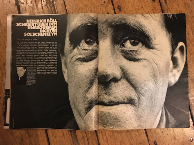
And another thing: Twen, June 1970.
Just how big can you print a face? Here’s a lesson from Willy Fleckhaus.


