So Young #7
So Young isn’t just a ’zine filled with snappy Q&A’s with young guitar bands, it’s also a place to discover new illustration, especially if you’re on the look out for more cartoonish, lo-fi and scrappy hands than you’re likely to find in the likes Anorak or Wrap.
Like old punk ’zines, there is nothing overly complex about the way that So Young is laid out: it’s an amalgamation of stuff that editors Josh Whettingsteel and Sam Ford like, laid out simply on the page but then brought together with brilliantly explosive illustration that matches the sounds being described.
In their editor’s note, So Young emphasise that they’re using the printed format as a kind of backlash to what they see as a prevalence in disposable music and art: they’re relishing the tangible in the same way that a collector might treasure an old record sleeve, and they see each issue as a similarly precious item to be collected.
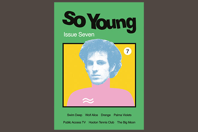
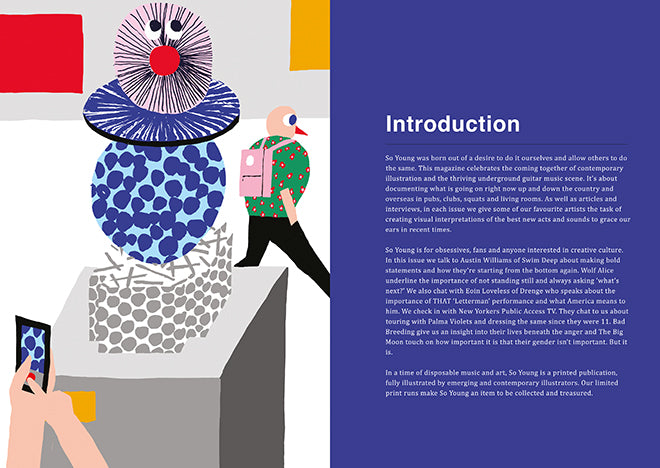
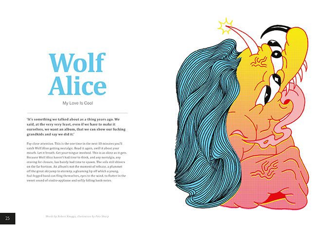
Newly released issue seven pops with a grass green cover and a collage by editor Josh, a composition that nods to the cut-and-paste ’zines of the past but with an updated flash of vibrant colours and computer generated lines. Inside, there’s a humorous illustration by Antti Kalevi at the front (below), a brilliantly textured black and white drawing by Clay Hickson (also below), and a giant, garish pixelated monster by Pete Sharp for a piece on the North London band Wolf Alice (also below). We caught up with Josh and Sam to hear more about the making of the contemporary music ‘zine.


Why do music and illustration go so well together?
I’ve always been interested in mythology within music, particularly bands, and illustrating them is a way of immortalising them. It’s a very special way of paying homage to the bands we love. The music we cover isn’t mainstream which makes it more fun to create these cult heroes through the illustration, we’ve been treated to a lot of vulgarity in some of the new bands over the last couple of years and seeing some illustrator’s interpretations of bands like Fat White Family, Sleaford Mods and Bad Breeding has been great.
Apart from that, illustration is the only visual language we know, I come from an illustration background and therefore it’s the natural medium to move forward in. It would be pointless for us to go with traditional band photography when it’s been done so much and so well before.
 And how do you match an illustrator to a band?
It varies, usually we like to give the artists a choice of bands because it’s inevitably going to lead to some great work if they are into the band themselves. But sometimes it would be a crime not to ask certain artists to illustrate certain bands when we see such a strong link between visuals and subject matter in both works. For example, Alex Gamsu Jenkins’ illustration of Drenge in this issue (above), I feel is a match made in heaven. Another where we asked an illustrator to draw a specific band was Maria Midttun’s take on The Big Moon (below).
 Most of your articles take a Q&A format. Why did you decide on this structure?
Initially we wanted to be a vehicle for the bands to speak directly to an audience, the goal was to let the band do the talking and it’s just what we like to read in other publications, we wanted to cut the bullshit so to speak. The magazine speaks to bands that people have a real passion for and we'd rather fill the pages with interview answers than extended description from the writer.
However as we’ve grown, we’ve got a few great writers involved who get the balance just right and understand our ethos. The format is always evolving so that may change in the future; we just go with what feels right to us at the time.
What were you listening to when you made issue seven?
The bands featured in the magazine tend to represent a time period. If they're in the magazine, it's fair to say that they've been on repeat for the last 3 months. A lot of the Wolf Alice record and the new Palma Violets album.
And what do you do when you're not making So Young?
We both have jobs to keep things ticking over but we’re mainly spending our time slowly developing permanent damage to our ear drums and livers, whilst out there experiencing the next issue of So Young in a live environment.
What have you learned from completing seven issues?
Paper is expensive. People still have a passion for physical magazines. There's an inspired generation of young people out there who can one day turn radio on it's head and give guitar music the leg up it deserves.


