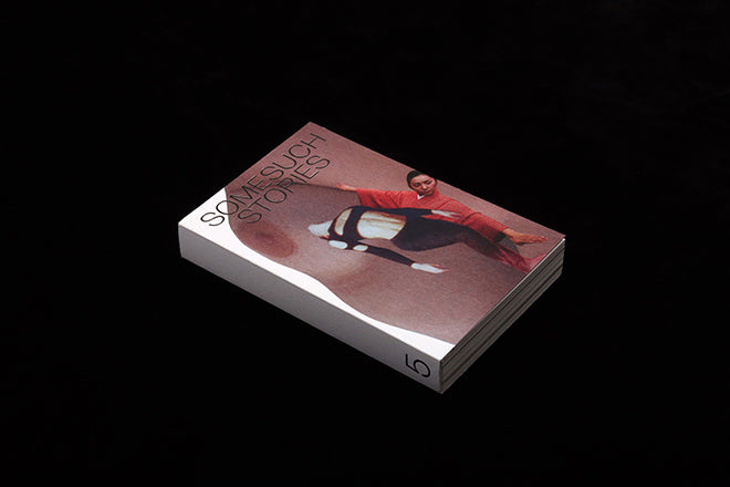
Somesuch Stories #5
Occasional literary magazine Somesuch Stories is back with another strong collection of prose, poetry and art, plus a refreshed design that shifts it into a new league.
We enjoyed the previous lo-fi look, and the new issue retains a similar simplicity in terms of a lack of fuss – there’s little by way of introduction or explanation of the theme. The reader turns from the contents page to the content, a directness invoking, perhaps, the theme ‘Action.’
But within the pages, each story is afforded its own identity in a way that brings pace and life to the near 300 pages. It would be easy to over-design on that basis, but instead, creative directors Lydia Garnett (late of Accent) and Luke Tudor Griffiths have set a structure that they gently break out of in various ways. Here, I highlight five of the visual touches they have applied.

ONE: The first story the reader finds after the content page is a brief series of colourful collage art by June Lam, who also created the cover image. This is a brave, wordless start to the issue.

TWO: Most of the long form texts use the traditional, bookish, typeface Bembo in a single, unjustified (and therefore less bookish) column; For Ella Plevin’s Deep Background,’ the story of an extra on a movie set, the columns twisting and indent randomly, subtly echoing the meandering thoughts of the actor.

THREE: Satisfying pages/sections of black break up the otherwise bright pages; Ariana Reines’ poetry jumps around in white out of the black for several pages, and a piece about a stuntman ends with this portrait of him tucked away, alone on the bottom right of the spread.

FOUR: Aside from the relatively small images I’ve highlighted, the only colour are several uses of this lovely spray effect. Not rough and messy, but a gently fading texture that is emphasised by the slight coarseness of the paper. ‘Solstice’ by An Yu uses a vivid yellow that fades across pages far more effectively than a flat tint of the colour. Note the space given to the tiny title, a common design throughout the issue.

FIVE: My favourite pages are those of Niamh Campbell’s ‘The Karmic Archive.’ Sequential paragraphs indent randomly, punctuating the reader’s experience and adding rhythm to the text. Splashes of colour are sprayed about, smaller areas of similar effect to the yellow of ‘Solstice,’ adding purple, red blue and pink.
None of this would make any sense without great content of course; this fifth issue provides a typically rich variety of stories; I particularly enjoyed Caleb Femi’s ‘The Painting on the Concrete Wall,’ a poem in the form of a description of a poem.
Editor: Suze Olbrach


