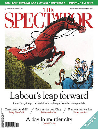
Spectator redesign

Kuchar Swara has given the rather tired Spectator a much-needed redesign, its first since the eighties. And very elegant it is too.
New York-based typographer Joshau Darden was commissioned to redraw the logo, removing the previous clumsy ‘CT’ ligature, and fonts from the Adobe library (including Goudy for display, Times for text and Futura as the sans serif) used throughout the project to avoid the cost of new type. The whole process took six months, a time extended by concerns over whether the highly conservative magazine should carry out Swara’s proposals or not.

In the end they did redesign, and have already had a good response from readers and advertisers. It’s good to see a magazine outside our design world putting effort into appearance. I particularly like the spacing between the massed the coverlines, above.


