

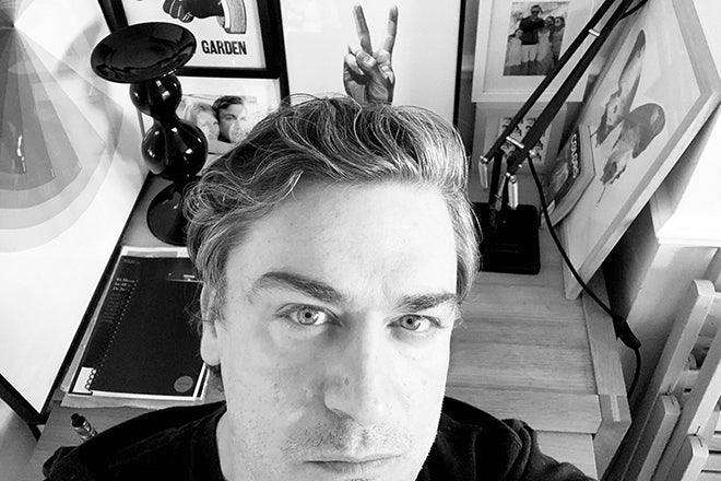
Stephen Petch, The Economist
Published since 1843, international weekly news title The Economist is instantly recognisable for its red logo. Stephen Petch joined the magazine (or is it a newspaper? – read on!) as creative director in 2017, and here he shares his working week and influences.
Stephen has extensive experience within magazines, having previously worked for titles including i-D, Time Out, The Independent and The Guardian. He oversaw the 2018 redesign of The Economist and continues to develop the brand as, like so many newsweeklies, it bucks the mainstream trend and increases its multi-channel readership. Follow him on Instagram for updates on what he’s up to.
Tell us about your typical Monday morning
Pre-Covid, my Monday would usually start with two very strong cups of tea, followed by a short walk from my home in Leytonstone, East London, to the tube station. From there it’s a 30-minute commute to our offices (The Adelphi) which are based near Embankment. If time is on my side I’ll get off at Holborn and enjoy the walk through Covent Garden.

Since the pandemic began, I’ve travelled to the office just once. Working from home has its perks: I’m not an early bird, so I’ve enjoyed the later starts, but the novelty has worn off somewhat. I’m genuinely missing the day-to-day interactions. Zoom and Slack are useful tools, but it’s not quite the same.

Describe your desk and what you can see in your office (view from window? colleagues?)
I use a Macbook Pro laptop, so I’m quite portable. This is no bad thing. My partner, our two teenage daughters, and I have been sharing (and working in) a fairly small space. The girls are back at school now, which helps.
If I were in the office I could be sat outdoors on the balcony overlooking the Thames (I miss that office).

Are you feeling optimistic about 2021?
‘Optimistic’ would be overstating it but it has to be better than 2020, right?
Which magazine do you first remember?
I don’t remember an epiphanic first interaction with one particular magazine. As a younger kid, I loved comics, such as The Beano, and football magazines, like Shoot and Score. My dad used to subscribe to National Geographic, which I found fascinating.

I think the magazine that had the most impact on me and made me think I could be a magazine designer, was i-D.
This must have been around 1990. I’d not long left school and had started a foundation course in design. My then lecturer, Lawrence Bogle, brought a few copies in to show the students. I was smitten. It was like a portal into another world. I grew up in Newcastle—which was great—but i-D shone a light on another, more exciting, world. The design had an attitude and was so dynamic, colourful, and bold.
I moved to London in 1995 and soon ended up doing a work placement at i-D, under the art direction of the great Scott King. At the time, I was completely broke but Scott would take me to the pub to play pool and he’d buy beer for me.
I thought all art directors did that. Halcyon days.

Which magazine matters to you the most this morning?
Not long after the first lockdown, I took out a subscription to The Atlantic. A great read, greatly enhanced by the beautiful design and art direction. My only gripe is that I tend to receive my copy well after the publishing date, by which time I already read many of the articles online.
When I complained about this I was told I could download a PDF from the website. I don’t want to read a PDF!
Back in the office, I'’d get to see The New York Times Magazine, which is always great, and ZEITmagazin is uniquely brilliant, but I don’t consume magazines the way that I used to. I simply don’t have the time—or don’t make the time. That said, I’m very much looking forward to the launch of Inque, Matt Willey’s ambitious new project: one magazine per year for 10 years. It doesn’t launch till October so I’ve pre-ordered a copy. From what I’ve seen so far, I’m sure the finished product will be stunning. Even the tote bag looks beautiful.

Lastly, I have to give a mention to Twen (above). It’s all a matter of taste, of course, but for me, it is probably the best-designed magazine of all time. Serge Ricco (Creative Director at L’Obs) has been posting covers and spreads via Instagram slide shows relentlessly. I’ve seen so much of it before but it never feels old.
Willy Fleckhaus was the master.

Describe The Economist in three words.
Global. News. Magazine.
The publication still refers to itself as a newspaper, yet it’s clearly a magazine. Discuss!
They do! And, despite my early protestations, I’ve kind of come round to it. I mean, how would you define a ‘newspaper’ or a ‘magazine’? The dictionary definitions are pretty close.
You could call it a weekly newspaper or a weekly news magazine. Either works for me.
What’s the studio set-up at the magazine?
The setup is different from what I’ve been used to in the past. The Economist has a dedicated cover designer (Graeme James) who has been at the magazine for over 25 years. As you can imagine he is a bit of an institution.
The cover process begins with the Friday editorial meeting, in which section editors will pitch ideas for leaders to the editor. At this point, we usually have a good idea of what’s going on the cover (or multiple covers), but this can change over the weekend.
Today (Monday), we’ll have another editorial meeting, just to firm things up. Later in the afternoon, Graeme will organise a meeting in which he will present ideas to a cohort of senior editors, myself and ‘Head of Graphics’, Graham Douglas.
My job at this point is to try to keep the group focused on what it is we’re trying to say. Too much subjective input can lead to a cacophony of competing ideas. The Economist prides itself on being a distillation of the weekly news. In my mind, the covers, should—by extension—be a distillation of a message or an idea.
On the layout and commissioning side, we have five full-time designers (Carole Alimo, Suzy Connolly, Mirabel Fawcett, Matt Withers, and Ben Shmulevitch). Carole is the lead designer but it’s very much a horizontal set-up whereby everyone does a similar job. All of them commission illustrations and all work across the sections. In addition: Matt is our deputy cover designer, deputising for Graeme when he’s away. He and Ben both regularly create art for the paper, the website, and occasionally for the cover; Mirabel collaborates with our social media team creating animations.
My role is to look at the wider picture, to provide cohesion, creative direction, and give feedback (I’m never short on opinions). There is so much more to consider than just the paper.
I have to keep an eye on the digital and social output too. We have 5.4 million followers on Instagram. It’s the main shop window to our content, whether we like that or not.
Over the past couple of years, as it became increasingly obvious just how important our social media presence is—both for getting our content out there, as well as driving subscriptions—we recruited two more designers (Egle Kazdailyte and, more recently, Ana Perez Lopez). They have added a new dimension: both are great illustrators who also happen to be great at animation too.

A lot of my time is spent working with other parts of The Economist Group on how we position the brand visually. It’s a Sisyphean task. I've done a lot of work over the past few years to consolidate what had become a mess of different styles, accumulated over time.
As the business expands it’s vital that we keep a unified brand language.
You’re commissioning some great illustration; what’s the secret to making that work well with both the artist and your editors?
Yes, it’s a mixed bag (with editors). Some can be incredibly literal-minded, but many others are much more open-minded about how we approach the story-telling and appreciate that we might create something fresh and unexpected. Sometimes, seeing is believing.
I’ve worked with news journalists and editors for a long time now and it’s not so different to what I’m used to. The biggest difference that I found at The Economist was the amount of input the journalists expected to have in the creative process. This was deeply ingrained, passed on from a time when there would be a bunch of cartoonists hanging around the office waiting for the editors to tell them what to do.
All said, even the most old-school editors have become less didactic when it comes to art as we’ve gradually built trust and showed that not everything needs to be imagined through the prism of cartoonery.
Since the redesign in 2018, we’ve slowly evolved and expanded the visual language of the art and we keep going. For a publication like The Economist — willfully mono-paced and text-heavy — it’s important to keep the imagery fresh, else it becomes wallpaper.
In terms of ‘style’, we deliberately try to keep things moving. The pages look the same but our content is diverse, so the art should reflect that. What might work well for a piece of global economics maybe won’t work so well for a story on girlhood—or the right to die.
What’s going to be the highlight of your coming week?
Having a lie-down.