Steven Heller, design critic
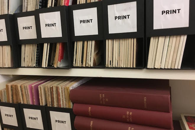
Who better to share their issues with us then design writer Steven Heller? Having been editor of typography magazine U&lc and writing regularly on editorial design for the likes of Eye, Print and Design Observer, Steven has obviously amassed a large collection of print over the years which he keeps neatly organised in the magazine library of his New York home.

This week we asked Steven to select three issues from his impeccably organised shelves for us: a new issue, an old one, and a detail from a magazine that he finds especially excellent.

A new issue: Esopus
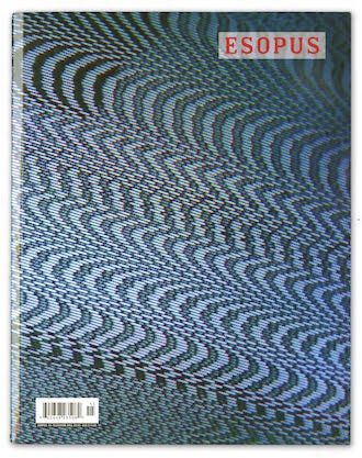
Esopus magazine, edited, published, designed and magnificently produced by Tod Lippy started in 2003 and is still going strong. It is a foundation-funded, advertising-free, art, literature and culture bi-annual that employs the most ambitious special printing effects being done today - and each issue also contains a mix music CD, which Lippy also produces.

Esopus is more than the proverbial labor of love. It stands along with Dave Eggers’ McSweeney’s for its driving cultural significance. His covers are distinctive yet unique. Using extreme close-ups he creates abstract yet recognisable patterns that ask questions rather than answer 'what is this magazine?’

An old issue: Portfolio
In 1949 Frank Zachary and George Rosenthal Jr. conceived this perfect-bound magazine on luscious paper with tip-ins and pull-outs. Christened Portfolio, it featured stories on graphic and industrial designers, poster artists, including E. McKnight Kauffer, cartoonists, such as Saul Steinberg, and a variety of vintage design ephemera, all tastefully designed by Alexey Brodovitch, art director of Harper’s Bazaar.
No expense was spared to make the magazine a jewel. Then they decided to sell advertising. ‘Well, we hated the ads we got,’ Zachary recalled. So they ran the magazine ad-free. The magazine lasted three issues before being shut down by Rosenthal’s father.

And another thing...: Push Pin Graphic, A Boring Story
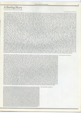
I am a big fan of the Push Pin Graphic edited and designed by Seymour Chwast. ‘A Boring Story’, with text set in three decreasingly sized blocks is hilarious. The fact is, reading anything in a block is tiring, this just speeds up the process of sleeping while reading.


