Swim #2
The second issue of London-based Swim collects another eclectic selection of work from its maker’s friends, this time on the theme Unseen. The work all comes from research and development, the bits and pieces that get forgotten as a project reaches completion.
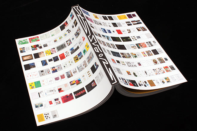
The result is a more satisfying series of pieces than the first issue, a little extra structure makes the issue more comprehensible to the passing reader. And whereas the cover of the first issue was as abstract as much of the insides, here the front and back covers feature a miniature sets of spreads – every page of the issue is represented, like a completed flatplan, giving a sense of what to expect inside.
The name of the magazine, issue number and a smiley emoji appears as one of these spreads, highlighted using a metallic sticker (above), and sure enough when you get to that page inside, there is the title, number and emoji repeated (below).
The cover is a clever way of exxplaining off the issue, and suits the content well. It is different but functional.
The inside covers are similarly ingenious; following the launch of the first issue, the Swim Instagram page was swamped with images from people taking its name literally and sharing photos of swimmers. These are collaged at the front and back of the issue (above). And note the URL of their website (below).
Everyone will find something to appeal among the chaos of drawings, typography, photography, writing, collage and different papers. In our upbeat review of the first issue we expressed hope that the next issue would be just as compelling; we can confirm it is.
Editor: Daniel Milroy Miller
Designers: Archie Nock and Samuel White


