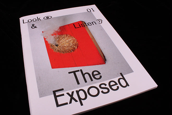
The Exposed #1
Our recent coverage of The New York Times Magazine’s use of a VR app alongside its print edition caused massive interest. Compared to many such attempts at print-digital crossover, it was that project’s relative simplicity that impressed. The two formats covered the same subject in different ways, ways that suited the two media.
 A similar (but lower budget!) approach is taken by new magazine The Exposed. The launch issue features work by five young photographers, each one given a series of pages to introduce their work visually with only a title page and small captions to provide any context. This approach allows space for the images, which float lightly on the page uninterrupted by writing of any length.
 But download the magazine’s free iPhone app, and a whole new context is added to each artist’s work. Each photographer has recorded an audio introduction and added video elements to specific images. The ‘ear’ icon (alongside caption, above) indicates video, the ‘eye’ icon is vidio. Unlike other scanning systems, The Exposed app can recognise the images themselves and link to the relevant media files via the app. No ugly QR codes.

This isn’t the first time such technology has been used, but alongside the visual and functional simplicity of the interaction, the editorial is also direct and simple.


The printed magazine does just enough to intrigue. It’s well designed and makes proper use of the print format – it just about works on its own. But add in the app and you have another whole level of editorial and creative interest.

Here’s what you see when you scan the image at the top of this story via your iPhone; tap the screen and you hear the audio track, accompanied by the image (below). It’s unfussy, simple, and ignores all the bells and whistles often added to such interactive projects to make them ‘exciting’ and ‘interactive’.


Sometimes we get insight into the artist’s working process. Aladin Borioli creates objects and photographs them (above); there’s something very satisfying seeing him at work (below) taking the still life images featured in the magazine as he discusses the project.

In some ways The Exposed is unremarkable; but so was the NYTimes Magazine project. Neither is overwhelmed by the technology, instead they concentrate on telling stories in ways that suit the various media they’re using. This strikes me as an intelligent way forward for combining different types of content.


