The Gourmand #7
If you’re a regular reader of the Journal you’ll know we love The Gourmand here at magCulture. Yet while we’ve written about it many times, we’ve never featured is as Magazine of the Week, until now. Issue seven – actually the eighth including the issue zero pilot – was launched last week with a party at the magCulture Shop and it’s a pleasure to take a close up look at the issue today.
 What makes The Gourmand so special is its quality across all elements of the magazine making process. As an object it is hugely satisfying; not flamboyant in terms of special effects and finishes, but it packs a nice hefty weight and the ever-switching matt and gloss papers work well together. The page edges of the magazine hint at the variety of content they contain (above).
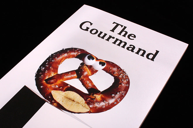
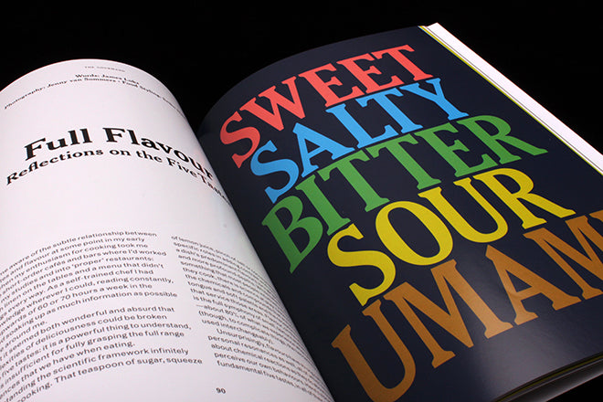
 The cover features one of five images from Jenny van Sommers; her complete set of five flavour types (above) are featured inside in similar light-hearted visual fashion, accompanied by detailed and personal notes from James Loks.
 This issue seems stronger than ever on photography. Much of it is so dense and beautifully printed on high gloss that it is virtually impossible to reproduce, but a representative example is this (above) from Aaron Tilley’s series of natural disasters created from food.
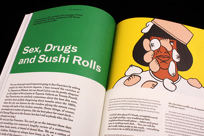
 The rich density of such photography is balanced by lighter illustrations, in this case Gwendal Le Bec’s series for an extract from Dan Jurafskies’ book about menu language.
 Objects are currently a favourite source of storytelling, and the items (above) selected by New York cookbook specialist Bonnie Slotnick are brought to life by here reflections on them. In what has become a regular celebrity research element of each issue, this time we revisit a sixties cookbook by actor Vincent Price’s (below).


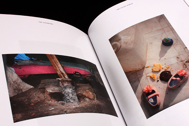
We’re brought back to the contemporary by Tom Skipp’s images from The Jungle in Calais, the ad hoc camp built by refugees (above). This might have been a pace change too far if the photographs and captions weren’t so deftly dealt with. Instead of shouting out their worthiness, they’re presented in a very matter-of-fact way that fits into the overall run of stories.
The Gourmand continues to stride ahead, producing great content in a beautiful package. It stands in contrast with Gourmand creative director David Lane’s other recent project, redesigning the Evening Standard’s ES magazine. The Gourmand shows what can be done when content and art direction share a desire to shoot high. Smart though its redeisgn is, it’s a shame ES didn’t aim higher and make better use of Lane’s talent.

Buy this issue of The Gourmand
from the magCulture Shop


