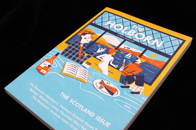
The Holborn #5
The Holborn magazine has been a favourite for many since it’s first issue was released last year. Readers are more often than not charmed by its approach, specifically the way that it imagines itself to be a gastro-pub in East London and how it divides each section of the publication into the building’s different ‘rooms’. So there’s the library, the bar, the pantry and the workshop – and as you pass through the pages, you’re encouraged to imagine yourself ascending and descending the sturdy wooden staircase of the imaginary, Victorian Holborn House (below).
I’ve always enjoyed the concept of The Holborn, but I’ve also wished that the layout could reflect the dusty corridors of the made-up building – imaginary structure and physical structure should be linked. Issue 5’s redesign addresses my concern and has injected the publication with a lot more whimsy and personality. The way that it’s done this is largely through commissioned illustration: drawings adorn the pages like the eccentric, mysterious paintings or intricate wallpaper you’d expect to be decorating an English town house if the town house were actually an indie magazine…
Editor Morgan Hamilton-Griffin had this to say of the change in format: “We decided to redesign partly as we made the decision to go bi-annual as a magazine and wanted to create a different offering that suited that new schedule. We also took on board what we had learnt from feedback over the course of our first year.”
In issue five’s ‘The Bar’ section, there’s an evocative illustration by Brittany Molineux accompanying an article on booze in the time of war (above), and in ‘The Wardrobe’, there’s beautiful cartoonish ‘wallpaper’ adorning the spread that designates the change of chapter (I think of these title page double spreads as the corridors taking you from one section to the other, below). In ‘The Pantry’, you can imagine the explosive array of food drawn by Sergiy Maidukov (also below) hanging over a dining table in the eccentric house. What it actually adorns is an article exploring the history of the Scottish breakfast.
Illustration suits The Holborn because its concept depends so much on the imagination, and illustration is inherently a extremely imaginative medium. I like the way that an article on Heals is illustrated (below) – it makes it feel as if the Heals in the magazine belongs to the same illustrated version of London that Holborn House exists in.
I’d like to see a bit more continuity throughout The Holborn in terms of the typography and the photography, but otherwise I enjoy the way that its image and vision is crystalizing through illustration. Issue five’s Scotland theme fills the house with something new too: we’re in London, but we’re also beyond the British capital and up North. The magazine is like an evocative portal rocketing you from paper to place.


