

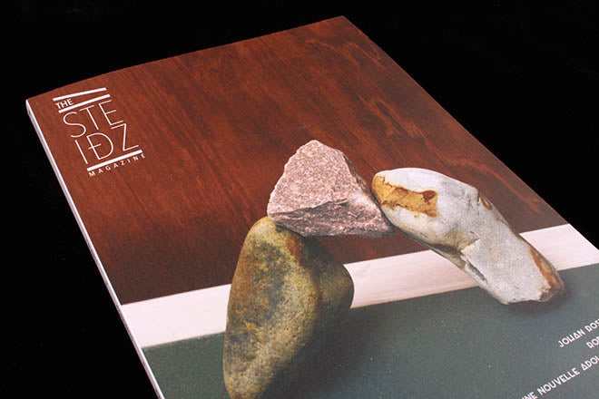
The Steidz
The Steidz is a magazine that I can only appreciate from an aesthetic point of view because I can’t read French (we’ve been thinking about unknown language publications quite a bit since Rob Alderson’s opinion piece last month). Looking at the photography, I can just about glean that it centres on art and design, but what really grabbed my attention is the publication’s intriguing use of bold, elongated and oddly rounded typography. The way The Steidz looks is quite unusual and not something I often see in contemporary magazines: as opposed to the unfussy, elegant typefaces that have become current favourites, it uses an amalgamation of typographic styles to pack a powerful punch and dominate spreads.
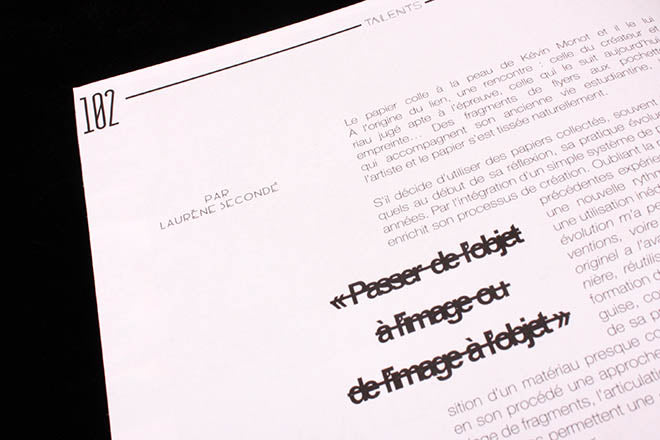
 Thick underling like you might find in a Dadaist manifesto; overlapping of photo and text; slender but bold page numbers; elaborate, geometric headers. These are the elements that make up a normal Steidz spread (above). Quotes are struck-through as if there was a fall-out between the magazine’s words and its design (below).
 Thick borders occasionally cascade through section headers to continue the struck-through motif (above), and fiery, bright yellow dominates each section title page to great effect (below).


Occasionally the format will break off into a different direction completely – but the penchant for bold, overlapping lines continues to prevail (above). The overall look is a refreshing cross between a collage, a Bauhaus newspaper, Louise Brooks’ angular bob and an alarmingly yellow caution sign. This can surely only be a good thing.