New York Times Magazine
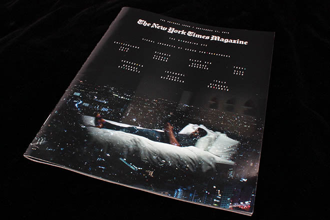
Last week’s New York Times Magazine featured this extraordinary cover image (above) by Alec Soth, announcing the annual Travel issue. As soon as I saw it I sensed every ad agency with an airline account Googling Soth’s name. This is how we want to travel!

Packed with excellent photography and beautifully printed, this is one of the magazine’s regular specials and deserves all the attention it’s receiving. From the contents page (above) to the opener (below) the dense black pages make the most of the bold white headlines and imagery. Anyone who’s seen a copy of Port will recognise the type detail present throughout the issue; from the tiny letter-spaced cover lines to the bespoke condensed headline font, the fingerprints of Matt Willey run through the pages.

It’s a deceptively simple concept: great photography (courtesy of the mag’s legendary photo director Kathy Ryan), well-edited and presented within a clear, strict, editorial structure; a structure the design builds on with deft variations of scale and careful use of detailing – the page below announcing the five travel stories is probably the busiest in the issue; thereafter the five stories run back to back with just a numbered announcement to start each one (final three images).


When you have great content you don’t need to overcomplicate the design; that said, don't underestimate the work that’s gone into these pages. Take this little detail (below) – those tiny cover lines feature some randomly coloured characters, so they better reflect the night time lights of Tokyo in the background of the image.

Editor-in-chief: Jake Silverstein
Design director: Gail Bichler
Art director: Matt Willey


