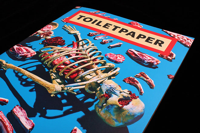
Toiletpaper #13
Toiletpaper is an astonishing magazine. One simple idea is pushed to the extreme, as its makers create a series of powerfully disturbing, heavily manipulated images. Each one fills a double page spread with full-bleed colour, unadorned by text or explanation.
It can be read as a critique of modern advertising imagery, a modern take on surrealism or just a bit of fun. What’s certain is that the Photoshop quality control is set to 10+ as the colour control gets pushed to a Spinal Tap-like 11+. The uncomfortable nature of the images is balanced by these super-bright colours.
The same front cover image was used as a recent cover by the UK edition of Vice, where it appeared a lot duller. Here it’s reproduced in all its hyped-up splendour, at once heightening and softening the impact of the image.
Concept and images: Maurizio Cattelan and Pierpaolo Ferrari


