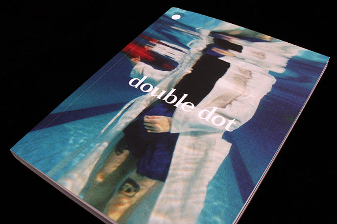
Double Dot #8
Double Dot takes two cities each issue and explores the cultural and creative relationship between them. There’s been a Chicago × Toronto issue, a Tokyo × New York one, and an issue particularly close to the magCulture Journal’s reality that paired London with Berlin. Issue eight arrives in a slightly larer page format, but is physically divided into two – as always with Double Dot – and the first half explores Seoul while the second looks at Paris.
It’s a magazine that invites you to compare and contrast – to think about what makes a city unique, and what qualities a place shares with and draws from another.
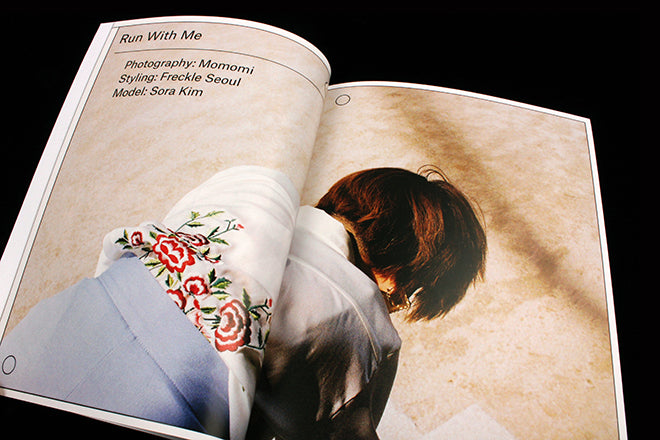
What makes Double Dot our Magazine of the Week this week is its handling of the digital day-to-day reality of working life. It visualizes and articulates how the creative industry is globally networked, while individual creatives are also very grounded in their hometown. Its visual language engagingly evokes collaborating and finding inspiration online, but also how people draw from their everyday surroundings. It does this by its juxtapositions: fashion shoots seem entrenched in place (above, Seoul; below, Paris), but the editorial design invokes the grid of iPhone screens (below). This contrast captures being digitally preoccupied and simultaneously experiencing the local.
For a magazine based in Toronto that works with collaborators across the globe for each issue, the design and art direction seems a perfect reflection of the publication’s own editorial process.
We began the week by looking at Sofa for our At Work With post – a new title that’s interested in the conversations that we have every day over WhatsApp, Skype, Twitter, iMessage, etc. while sitting on home sofas. It’s opted for a loud and aggressively satirical editorial design that will be divisive for readers. Double Dot is more subtle in its allusions to the online world and I find this effective. Unlike Sofa, which is so over the top that it looks at its topic from an obviously outsider’s perspective, Double Dot’s design seems to simply reflect its makers’ reality. There’s something pleasingly honest about it.
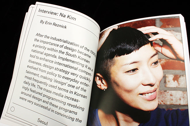
In the Seoul section of the magazine, there’s an article on traditional cooking pots in Seoul (which is decorated with parenthesis, as if the author were visualising the story with type to a friend via WhatsApp, above). There’s a beautifully silent comic by Shin Morae (above) – a Seoul version of Adrian Tomine’s famous New Yorker ‘Missed Connection’ cover and that replaces Tomine’s book with bubblegum. Then there’s an interview with artist and graphic designer Na Kim (below).
The two dots of the title’s name transition the reader from Seoul to Paris in the publication’s centre (above) – a lovely detail that’s repeated in every issue, as is the shift from sans to serif typography.
In the Paris section, there’s an article on the banning of the hijab in the city (above). Beautiful illustrations by Jade Perkin accompany a short story by Harriet Lye (below), and an interview with artist Camille Henrot is an intriguing juxtaposition to the art world explored in the Seoul section of Double Dot.
There’s many magazines that look at place, but what is often missing from these geo-centric titles is a sense of how a sense of place isn’t only local but also influenced by digital networks. We’re now seeing titles, like Sofa, beginning to explore this. Double Dot has been investigating the influence of global connectivity on creatives in cities for eight issues now. It’s simple recipe is highly effective.
Editor-in-chief/art director: Shannon Jager
Managing editor/co-publisher: Julie Baldassi
Editor: Isabel Slone


