

Wallpaper* redesigned
Wallpaper* reveals a new look this week with their September issue. Led by creative director Sarah Douglas and art director Lee Belcher, the typography has been completely overhauled. The previously Swiss/brutalist headline face Graphik has been replaced by a more decorative set developed by long-time collaborators Paul Barnes and Christian Schwartz of Commercial Type, softening the overall look of the pages.
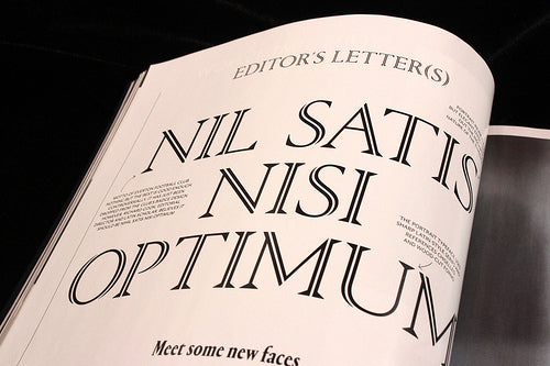
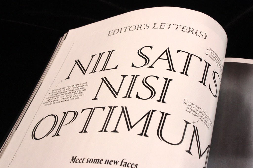
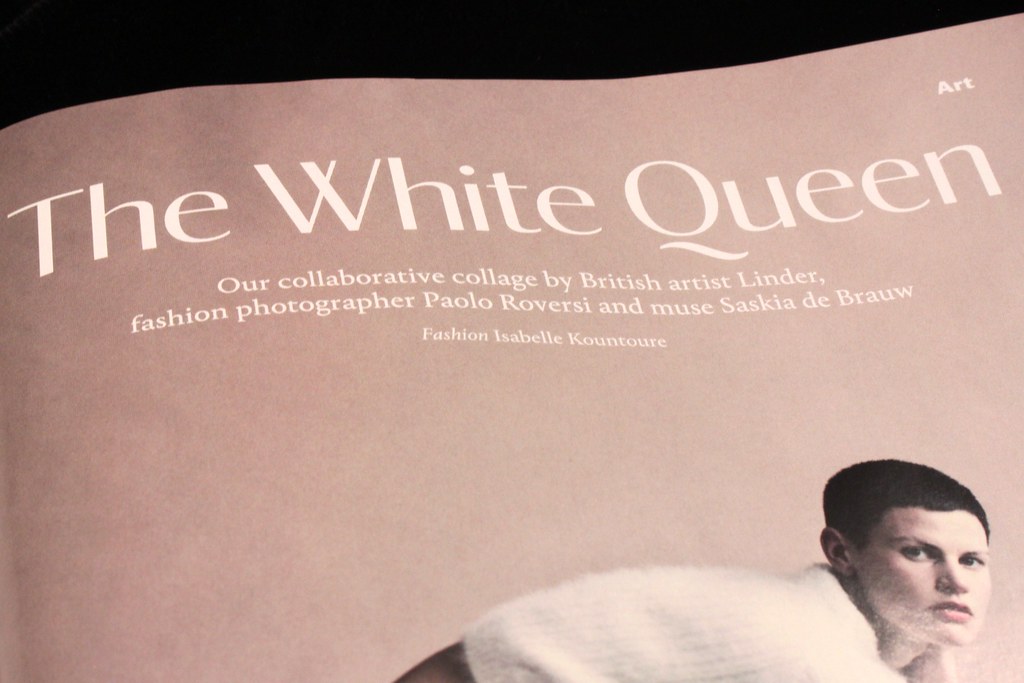
The features well uses a new serif face, Portrait (condensed version above) which comes in multiple weights, including an inline version (top image) and in its heavier versions reminds me of Commercial’s work for The Guardian (below).
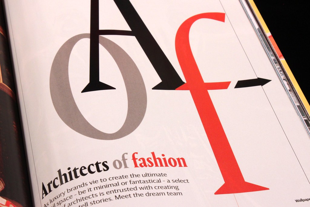
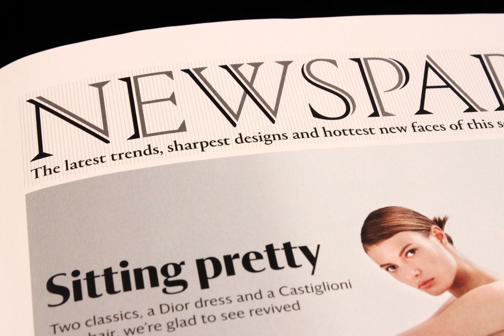
The back section of the magazine (fashion, photography) uses Darby, a subtle, humanist sans serif (above) that is a strong alternative to Portrait. Love that Q!
Here’s the inline Portrait and bolder Darby shown together – a much more flexible set of fonts for the magazine.
Alongside the print redesign the iPad edition has been reworked and the website is being re-designed by Nic Roope and Marc Kremers. Eagle-eyed Wallpaper* readers will also spot that the asterix in the cover logo no longer has the cursor arrow added to it. Seems we’re all digital-native now.
Read an interview with Sarah Douglas on CRBlog and further details about the fonts from Commercial Type.