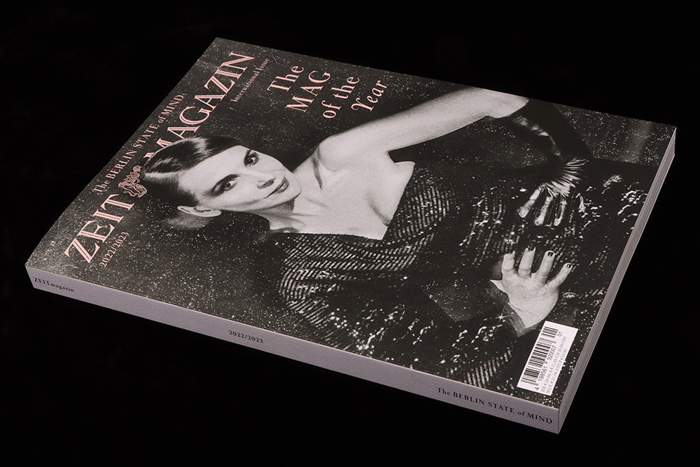
ZEITmagazin Internatıonal, 2022/23
The annual international edition of ZEITmagazin is always a great reminder of what we English-speakers miss in the weekly German edition. Here’s a quick look at some visual highlights from this year’s issue.
The first thing to note is the vast physical difference between the weekly and annual versions of the publication. Being a newspaper supplement, the 64-page weekly edition is produced using a slightly crisp, very light paper at a practical A4 size (practical as they sell over 600,000 copies per week). The 270 pages of the annual version are about 30% larger and use a heavy matt paper. It’s perfect-bound and absolutely luxurious.
As editorial director Christoph Amend told me, ‘For the annual issue we’re creating a coffee-table atmosphere, which makes you keep and collect the issues like you would with a beautiful photography book at home.’ In other words, an annual indie mag (anybody who heard Christoph speak at magCulture live last year will recall his passion for indies!)
The design is essentially the same in each edition: a simple monochrome template that works well in both formats. The layouts have a clear and recognisable identity but otherwise exist as a structure to present the brilliant words and images to be presented—this magazine is all about the commissioning.
Being able to draw on a year of weekly issues means the 2022/3 issue boasts long-form interviews with a series of cultural celebrities: Juliette Binoche, Julia Fox, Jeremy Irons, Adele, Amanda Gorman and more.
 One
One
Richard Burbridge’s portraits of Julia Fox, ‘New York style icon’, are a typically strong celebrity contribution.

Two
From celebrity to pure invention: three spreads of Jon Burgerman’s spray paint characters fill the pages with bright colour. Quite loose and abstract, they’re brought into focus and relavence with the caption ‘Representing joyful resilience in the face of war, climate anxiety, the pandemic and financial chaos…’

Three
The magazine also gives plenty of space to more traditional editorial illustration; this example is one of a series by Nolan Pelletier for a feature about learning guitar from YouTube during the pandemic lockdown. Gorgeously retro, it fills a full page opposite a page of text. This is no-nonsense editorial design, rightfully confident of the quality of material being presented.

Four
‘Going Bananas’ features a pair of New York artists who occupied themselves over the lockdowns by creating art from the contents of their apartment. Lina Sun Park (above) created the art, husband David Brandon Geeting photographed it.

Five
Alongside its international outlook, the magazine always returns to its subtitle, ‘The Berlin State of Mind’ and photographer Tereza Mundilova’s portfolio does just that. The series features young Berliners sharing brief thoughts as they are photographed, the pages presenting their headshots at almost lifesize on the magazine’s large pages.
There’s plenty more to enjoy in the issue, but these examples give a sense of the skillful commissioning that underlies the project.
Editorial director Christoph Amend
Editor Sasha Chaimowicz
Creative director Mirko Borsche
Art director Jasmin Muller-Stoy


