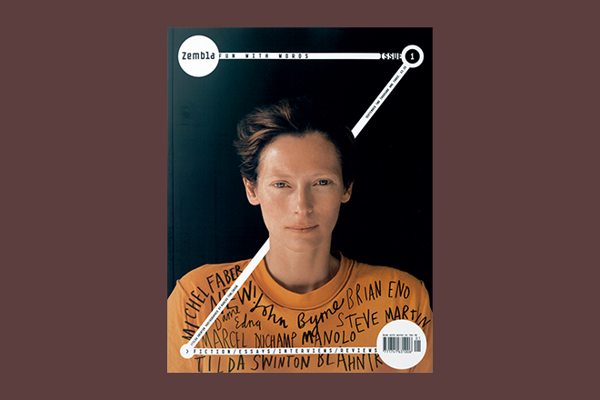
Zembla, 2003-2005
At the end of our last Podcast, our featured Back Issue was British literary magazine Zembla. Editor Dan Crowe recalled the discovery of doing your own thing in your own magazine. Here are some covers and spreads from early issues.
One of the precursors of today’s indie scene, Zembla sought to cover books and writing from a broader cultural point of view. It took it’s subject seriously but was the polar opposite of a dry, literary journal; ‘Fun with words’ read the cover. Founder/editor Crowe teamed up with art director Vince Frost and his then assistant Matt Willey. The visual result speaks for itself; a powerful typographic aesthetic from the cover format on.
The large ‘Z’ shape on the cover remains a unique identifying motif. The cover above was perhaps the most successful iteration, wrapped around Tilda Swinton. This melding of type and image was to be a key part of the art direction and design of the entire magazine.
If elements seem overused now — the handwritting across Swinton’s shirt – the overall impression remains as powerful as on first publication. It’s also fascinating to look at in the context of Crowe and Willey’s subsequent collaboration (along with Kuchar Swara) on Port magazine, as well as Willey’s New York Times Magazine designs.


