ModMag report: London 2018
The sixth ModMag London took place last week, returning to the wood-panelled Conway Hall for the second year. 300 people packed the venue to hear a day of talks that opened with Carol Montpart describing the gentle evolution her biannual The Plant and ended with Emmet Smith from the monthly National Geographic delivering a case study in major editorial reinvention.
magCulture founder Jeremy Leslie introduced the day, highlighting the theme ‘Reinvention’, before welcoming an extra speaker to kick things off.
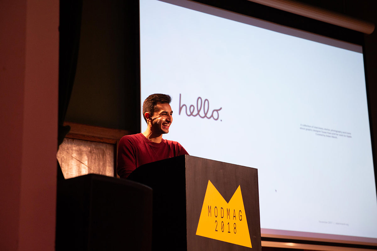
Inspired by the first NY Edition of ModMag earlier this year at Parsons School of Design, Chelsea School of Art graduate Adam Marsh was invited to show his student publishing project about Apple’s first designer, Susan Kare. A treasure trove of clever visual references, the work featured Kare’s early icons and pixelated fonts alongside recent Apple assets like their San Francisco typeface.

Jeremy then handed over to the day’s host Liv Siddall, the familiar face of ModMag and now voice of magCulture via the magCulture podcast. Liv provided the tone for the day — a happy combination of magazine knowledge and relaxed humour.
Cultivating covers
The challenge for any magazine wishing to reinvent itself is to do so without losing its core identity. This was certainly the case for National Geographic, redesigned earlier this year.
Discreet changes have been made during its 140-year-old history, as art director Emmet Smith noted in his beguiling animated flick through every single one of the magazine’s covers. But nothing quite at the level of this years reinvention.

The redesign was kickstarted by the magazine’s CEO suggesting, ‘Let’s make it bigger’ one morning. While its famous small format didn’t change, other fundamental parts of the magazine did. As Emmet explained, National Geographic has always been ‘for curious people who know that there is more to discover’. Yet the focus for that exploration and discovery needed to shift.

Like so many legacy publications, the broader context for NatGeo has changed enormously. The magazine had to shake off the remaining colonial aspects of its coverage of the natural world. Editor in chief Susan Goldberg asked the question, ‘what does exploration mean in 2018 and beyond?’ The answer was by shifting the emphasis from exploring the outer world to examining our inner world. Thus people have become the focus, with stories covering addiction, gender and race.

For a design to match this editorial direction, Emmet called in the team from Godfrey Dadich, the west coast creative studio launched by ex-Wired editor/creative director Scott Dadich (another previous ModMag guest). Together they sharpened up every element of the magazine’s design. A new set of typefaces were commissioned, named after various explorers and photographers (as we heard about this, we also learned that the magazine has its own ‘Explorer in Residence, Sylvia Earle, a condensed slab serif). This was a textbook description of how to reconfigure a magazine, complete with failure and dead ends before eventual success. Type designer Tal Leming’s initial work was dismissed (by Tal himself) as ‘terrible.’

Perhaps the most symbolic part of the entire project was the redrawing of the NatGeo logo for the cover. We had already heard how Carol Montpart worked with Seb McLauchlan on the awkward spacing between the capital L and A of ‘Plant’; Emmet had a similar issue with the R and A of ‘Geographic’. These were elegantly combined to close the space between the two characters. He then took apart all the other elements of the cover, explaining how he added small red typographic elements to the famous yellow border.

A more fundamental discussion of cover architecture had been given earlier Dan Sandison, editor of independent football mag Mundial. What started as a one-off world cup project in 2014 has grown to be a popular and regular presence in your local indie mag shop and beyond.
Dan’s talk used the development of the magazine’s covers to give an overview of its growth. With his typical wit he explained how an initial desire for a cool, coverline-free look appealed only to ‘a dozen followers on Instagram.’ He wanted Mundial to be more than just a hip indie, and went through various different cover ideas, settling on a series of iconic players in action accompanied by a full set of coverlines and the tag ‘Reminding you why you love football’ to clarify what the reader should expect.
Such commercial moves might seem anathema in the indie world but it was refreshing to hear such honesty. Yet there was still time for indie coolness, as Dan described one cover as shamelessly taking the red background and super-condensed typography of 032c.
Finding features in photography
Two magazines in the day’s lineup focused on creating original photography. Carol Montpart spoke compellingly about the seven-year history of The Plant, describing its various iterations. The latest rethink, earlier this year, saw a larger format and new logo, as well as a shift to treating ‘photographers as authors’ as part of a desire on the part of the three-woman creative team to challenge themselves.

We’ve heard similar things over the years at ModMag – the idea that if the creators continue to test themselves, the readers will remain engaged. This approach has certainly worked for The Plant; a regular conversation among magazine retailers involves what’s selling and everyone we've discussed this with lists The Plant among their best-sellers.
The renewed focus on photography was exemplified by a feature from their recent twelfth issue; Carol detailed the thought process and planning that went into a shoot by Scheltens & Abbenes featuring watering cans floating in water. The attention to detail was impressive, emphasising the level of preparation required to achieve such an effortless-looking and beautiful end result.

Archive images also plays an important part in The Plant. Carol shared a sneak peak of a few stories in the upcoming issue 13, including a beautiful series of personal shots by the late Linda McCartney.
Biannual magazine Ordinary, founded by Max Siedentopf also majors on photography but takes a very different approach. A full-time creative director at KesselsKramer, he talked through a number of side projects that added a dose of light relief to the day.
Among a number of aphorisms he shared was ‘perfection is a dead end,’ a challenge to some of our other speakers. His approach to Ordinary was similarly direct; he explained it was printed on ordinary gloss paper, at an ordinary A4 size, and used the ordinary Arial typeface (on the rare occasions text is required).

Each issue of Ordinary features a cover-mounted everyday item; this item is then featured inside in a series of artworks by a string of artists and photographers. Siedentopf hands creative control to his participants, asking only that they make the ordinary object a little bit extraordinary. ‘Give creative freedom (even if you don’t like it)’ was another of his messages.
He introduced his brand new seventh issue, featuring a plastic drinking straw, observing that this now ordinary item will in a few years be extraordinary after its new found notoriety as icon of single-use plastic sees it banned.
Necessary trouble
As part of a quickfire series of indie mags after lunch, ex-Dazed editor Rod Stanley stirred things up with his newspaper Good Trouble. Inspired by the creativity and energy of the Women’s March and anti-Trump protests, Rod launched Good Trouble online from his adopted home of New York City to cover the new activism ‘through the lens of art and culture’.

He then collaborated with designer Richard Turley on a print version, launching it last year as a broadsheet newspaper to immediate attention and success. A challenging project in terms of content and presentation, Rod lit up the room with his explanation for the name of his publication: ‘When you see something that is not right, not fair, not just, you have a moral obligation, a mission and a mandate, to stand up, to speak up and speak out, and get in the way, get in trouble, good trouble, necessary trouble.” – Rep. John Lewis, Nashville, 2016.
Another NY project, Eye on Design, also made the leap from digital to print last year. Founder/director Perrin Drumm described how the print and online editions work in tandem rather than against one another. Her virtuous circle connecting print, online and events remains a key reference for the day.

Perrin’s presentation was both precise, with details of reading habits on the different channels, and warm, the tight design balanced by internet memes and emoji references that reflect her magazine. She’s worked at a number of larger magazines, but this is her first launch and her description of the experience as ‘the dreamy nightmare of starting a magazine’ neatly reflected the ups and downs of the process.

She explained how her magazine stood apart from more traditional graphics publications, covering broader issues affecting the industry and its practitioners rather than worshipping the great and the good: diversity in the workplace, free pitching and whether designers should unionise.

The following session was a discussion based around Ian Birch’s excellent new book ‘Uncovered’ which looks in detail at 85 front covers from the last 50 years. The most experienced magazine maker on the bill, Ian traded insights with Olivia Ahmad (editor of Varoom!) and Jeremy Leslie. The series of covers started with the cover of the second issue of Eye on Design, comparing its psychedelic design with that of sixties counterculture mag Oz. The discussion progressed through eras and genres in a similar manner, highlighting how issues like feminism and race have been addressed at different times.

Later in the day we heard from another recent US launch that shifted its position in response to the political changes in that country. Deidre Dyer, executive editor of No Man’s Land, explained how the magazine was planned as the last election campaign ran. Published by women’s space The Wing, and with Hillary Clinton the presumed winner, the magazine began against a very different context to that which it finally arrived to: Trump in power, women’s rights being challenged at every turn. This has driven the project faster than originally intended; issue two has ‘more bite to it’ and has been distributed beyond the States.

Alongside this bigger picture, Deidre shared some of the hands-on experience of launching a magazine for the first time, describing her naivety about key things like distribution; receiving the full 9000 print run at an upstairs office without a freight lift being a particular lesson.
Following directly after Rod Stanley’s rabble-rousing presentation, Valerie Wickes from Beauty Papers had a tough task but nimbly applied his ‘Make Good Trouble’ plea to her magazine. Launched in response to the ‘pseudo glamour’ of most beauty coverage, it presents a satisfyingly non-conformist view of beauty, encouraging professional hair and make-up artists to challenge their own thinking. After three years, the magazine has taken an influential position for itself, and with beauty lined up as the next big boom area it seems well placed to benefit. Look for its influence on the upcoming Dazed Beauty project.
Femininity and fluidity
Traditional areas of feminine space were also reinvented by other magazines that were part of this year’s ModMag line up. Like Beauty Papers, the recently launched A Dance Mag challenges a well-established genre.
Editor Jana Al Obeidyine flew in from Beirut to present her project, setting the scene with a brief overview of traditional dance magazines and their prima ballerina covers before contrasting them with A Dance Mag.
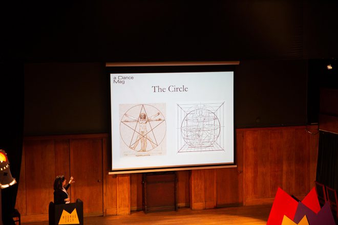
Dealing with the feeling, experience and meaning of dance rather than personalities and reviews, her magazine is quite an abstract proposition. She explained her belief that dance could be ‘any rhythmic movement’, using a video closeup of feet walking in rain as a demonstration, and described the act of dancing as cathartic. Jana shared relatively few pages from the magazine, but spoke eloquently about the use of spiral shapes on the cover and pages to express movement, something she credited creative director Ibrahim Nehme (a speaker at ModMag 2105) for. Her quietly passionate talk was in marked contrast to others but perfectly reflected the first issue of her magazine.
Inspired by ‘Hermione Granger and difficult women everywhere,’ Elisabeth Krohn also set out to reinvent a genre. She asked herself what a magazine for the teenage witch could be, and the resulting magazine, Sabat, reinvents not only its genre but also the core aesthetic of magic visuals, ‘a witchy riot girl vision,’ as she put it.

Comparing the existing print magazines with the vast Instagram feeds of witch imagery, ‘It was clear that Sabat needed to reinvent a dated aesthetic’, she explained as she shared the beautiful designs (by Cleber Rafael de Campos) and production techniques of her series of three magazines. The dense pages are borne of a love of dirt and the earth, with typography inspired by 17th century witch trial posters and analogue photography giving a unique texture.

She confessed her initial entry point to witchcraft was a superficial one, but that this soon changed as she and her team were inundated with responses from practicing witches; this community-sourced material became a cornerstone of Sabat. ‘I have since learned that many serious witches got into their craft in the same way,’ she added.
By contrast, Elle UK creative director Tom Meredith has to work not to create an audience but maintain one. Tom shared his various roles at Elle; starting with the biannual Elle Collections series, notable for its highly detailed design and Instagram-like repeat imagery, he then moved to the root of the magazine’s history in Paris. He spent two years there working on the original weekly French edition, enjoying the speed of production but also making use of the vast archive of sixties and seventies Elle.

He has since returned to London to oversee the latest reinvention of the British monthly edition. Working with new editor Anne-Marie Curtis, the magazine has been redesigned, with the hero of the piece being a new headline typeface commissioned from London studio APFEL. Loosely based on (and designed to work alongside) Elle’s historical reference point Futura, it is sharp, smart and flexible.
Tom ended with the magazine’s September 2018 front cover, a story he was justifiably proud of. We constantly wonder about the cross-fertilisation between indie and mainstream magazines here at magCulture and this is a great example of just that. Starring bisexual model Slick Woods, it shows her pregnant and proud. Despite management pressure to crop out her baby belly, the creative team stood their ground and won the argument. Tom and Anne-Marie aim to achieve this type of story every month, ‘we try to make it seem like more of a special event than a monthly magazine,’ Tom said.
Reinventing distribution
Although ModMag speakers are largely selected for their creative stories, the day is also packed with thoughts about the business models and practicalities of magazine-making (‘Distribution is a bitch,’ Perrin Drumm accurately reported during her talk). Both Courier and Homesick are built on intriguing creative strategies but it was their distribution plans that linked them to reinvention.

In his forcefully passionate talk, Courier founder Jeff Taylor shared advice for anyone planning their own launch, debunking clichés. ‘People who tell you to start a business doing something you love are, for the most part, talking crap,’ was a typically direct instruction; if that sounds harsh, his presentation was balanced by his obvious love for what he and his team achieves.

He shared amusing details of their first issue, telling us how they ‘borrowed’ an ad from another magazine, and fleshed out the team list on the contents page so the new magazine appeared ‘more professional’ (above). The business/start-up title started life as a free magazine distributed in cafés and bars around London, but earlier this year pivoted to a paid-for model and hasn’t looked back. They’re in the process of launching a new free publication for London and recently held their first ‘Courier Live’ event.

Homesick also used free distribution to establish its presence with two issues over the past year. Founder Reagan Clare is a professional archivist and her magazine picks up on that, presenting pop culture history that she has discovered in the real world rather than via Google.
Her magazine is an agreeable mix of subjects and stories from all eras. In that respect it could easily end up like any one of a multitude of art/culture lifestyle magazines that indulge their maker’s interests. Thankfully her cultural antenna is well-tuned and the sense of discovery in the pages a delight. Moving to paid-for is a brave move but deserves to pay off.
While the day was set up to focus on ‘Reinvention’, like every ModMag, other themes emerged: the print-digital divide is no more – the two coexist; as standalone digital channels split the world, print promises a sense of unity; the political is going mainstream; distribution remains the one truly broken part of the publishing process; attention to detail is everything.
Perhaps, though, the enduring theme of every ModMag continues, neatly encapsulated by the quote above the stage at Conway Hall: ‘To thine own self be true’.
Report compiled by the magCulture team; all photographs by Dunja Opalko.
Other reports:
The Stack – Monocle24 Podcast
Stack Magazines
It’s Nice That
Instagram: #ModMag18
ModMag London 2018
Curator: Jeremy Leslie
Producer: Stephanie Hartman
Host: Liv Siddall
Event design: magCulture Studio
Front of house: Lesley Allan & Raechal Isolda
magCulture Shop: Jamie Atherton & Ewan Leslie
Social media: Hope Brotherton & Steven Gregor
Keynote guru: Esa Matinvesi
Student helpers: CSM BA Graphics
Thank you to all our speakers, Rob Alderson, Paul Barnes, Alison Branch, Cath Caldwell, Carina Dvorak and the team at Conway Hall, Jean-Baptiste Lévee, Danielle Pender, Yael Roth, Daniel Sawney, Thea Smith, Ben Winders, Michael Young, the Zetteler team.
Thank you to all our ModMag partners: