


Victory Journal #17
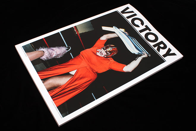
American mag Victory Journal is a sports publication like no other. First, it’s massive: the magazine measures 277 x 418mm, taking large-format print to the next level. Secondly, it’s predominantly visual – if a feature includes text, it’s printed in a font smaller than the page numbers. The quality of the images is such that I wanted to showcase five of my favourites.
ONE: The magazine prides itself in ‘spotlight

TWO: At first glance, Pelle Cass’s photographs seem to capture astounding sporting events; a crowded swimming pool full of divers miraculously avoiding colliding into one another, a packed ice rink squashed with far too many players. At second glance, you realise – ‘ah, a photoshopped collage’. But Cass’s photos are neither; instead ‘the anarchic jumble of athletes’, as A.S. Hannah describes in his accompanying essay ‘Multiplicity’, is an image made up of multiple frames, each moment existing simultaneously alongside the next. Take another look – you can trace the journey of a single footballer making his way across the pitch.

THREE: Kellen Hatanaka began painting in 2017, as a way to find ‘respite from the constraints of his illustration practise.’ The results are almost like sporting still-life, players at both work and play, immortalised in oil stick and acrylic paint. Observed by an artist, rather than the court-side press, the images of these athletes are surprisingly touching – especially Shot Caller, (above) in which a basket-ball player makes a phone call, a dopey smile lighting up his pink face.

FOUR: Art world favourite David Shrigley pops up in the issue too: a series of his illustrations printed at a satisfyingly large size. The crude images of various sporting endeavours are accompanied by Shrigely’s trademark sardonic captions (PLAY TO WIN). The partnering interview that discusses Shrigley’s design work for amateur football club Whitehawk is a great example of Victory Journal’s dedication to covering the ‘intersection of sport and culture’.

FIVE: This photograph is of pitcher Jeff Praml of Southern New Hampshire University, and captioned ‘While the opposing team takes batting practise, players typically take runs to the nearest gas station for snacks and energy drinks.’ It’s an image that wouldn’t look out of place in an i-D photoshoot, it’s made automatically cooler by its candidness.
Editor-in-chief: Chris Isenberg
Creative director: Aaron Amaro