

Wired Italia #81
The Italian edition of Wired closed a couple of years ago, and creative director David Moretti moved across the Atlantic to work on the US edition. But readers and advertisers wanted Condé Nast to bring the Italian edition back, and last year it returned under the design direction of Massimo Pitis, with Moretti as a consultant. It’s just won Magazine of the Year at the prestigious SPD Awards in New York, beating California Sunday Magazine and The New York Times Magazine. What better time to take a look?

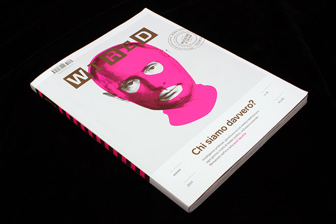
The previous iteration of the magazine followed the familiar Wired design direction: dense with typographic play, technical structure and a dramatic use of colour. The new version could hardly be more different. The front cover uses two special inks (flouro pink and metallic gold), a familiar part of the Wired identity, but the design is cleaner, simpler and everything’s smaller: the logo, image and headline all sit in open white space.
This approach is continued throughout the issue. A series of section openers use a beautiful series of photographs of coloured fabrics representing numbers (slideshow above) and the layouts within each of these sections follow a strikingly simple, modernist, grid structure. This could easily be mistaken for a well-designed independent magazine, such is the stark, systematic, cleanliness of the pages (below).


For this approach to work, the detailing has to be really smart: there are two scales of drop caps that run throughout the issue: a page-sized one and a smaller version that floats in an exaggerated space (both in the image below). Such variation in scale is a rare and satisfying sight.

If the page above seems typographically dense, others are even heavier, with regular columns of text running across the whole page (below). And when a text ends mid page... well, it ends (also below) in book-style.


Among these dense pages sit some great pieces of commissioned illustration. Though I’m not so keen on the cover image of Putin, the cover opens to reveal a paired image of Trump (below) and alongside the cover feature there are some stronger images by the same artist (Heath Kane, also below).


The illustration work is strong throughout, and surely a reason why it attracted the attention of the SPD judges. Here are some more examples:


Often this type of design ends up boringly corporate: efficient but characterless. But Wired Italia has a uniquely contemporary take on modernism. Its functional efficiency is matched with a lively visual personality that lifts the magazine beyond the clichés of the super-clean starkness so often used to signify ‘tech’. It also rewrites the Wired visual language.
It’s a really impressive piece of design, a strong template into which great visuals are showcased. For that reason it’s our Magazine of the Week.