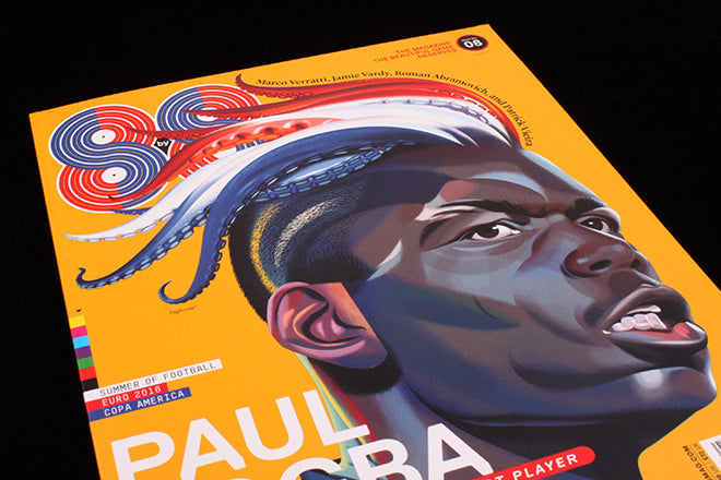
8 by 8 #8
The English football season may have ended but the Euros kick off in a couple of weeks so there’s little chance of a break for the ever-growing selection of small football magazines. These range from new launch Season, offering a female perspective of football fandom, to more familiar titles like Mundial. But right now, my favourite is 8 by 8, a New York based large format magazine edited by ex-pat magazine maker Robert Priest and designed by Grace Lee. Their eighth issue has just been published, celebrating the upcoming Euro 2016 competition.
Subtitled ‘The beautiful magazine the beautiful game deserves,’ 8 by 8 draws on Priest’s long experience art directing US magazines as much as his ex-pat longing for live football (he moved to NY from the UK in the eighties). The magazine is a tour-de-force of graphic stylings, typography and illustration, and won several medals at the recent SPD Awards in New York. From the cover and contents page (above) onward, the layouts are intensely worked in a manner typical of the big US titles – look at the detail in this opener to a piece about Paul Pogba (below).
The look is quite old-school New York, the complex headline treatments competing with the photography. It’s the very opposite of the minimalism of today’s independent magazines, but it works really well in the context of Robert and Grace’s passion for the game. That passion almost oozes from the pages, from the cartoonish celebration of surprise star Jamie Vardy by Jeffrey Decoster (below) to the player-by-player guide to the Euros (also below) which echoes the magazine’s name and logo.
With Grace leading the art direction and design, Robert focuses on the writing. The temptation is to focus on all the eye candy but the magazine features the best football writers, many, like Paulo Bandini and Simon Kuper, familiar to UK readers. As a Chelsea fan I particularly enjoyed Kuper’s well-researched piece on Roman Abromovich (below).
There’s also an excellent piece by Philippe Auclair about the state of football in the Euro 2016 host nation France, with a delicate opening illustration by Tom Dilly Littleson (below). These two examples show the range of styles and shift in gear the team achieve.
It’s not an exaggeration to say I could have selected any spread from the issue to show in this post, but I’ll end with one last example, Italian striker Marco Verratti (above) photographed throwing himself around in a hotel room, his name bouncing around him in bold captitals. Let’s hope the Euros as as much fun.


