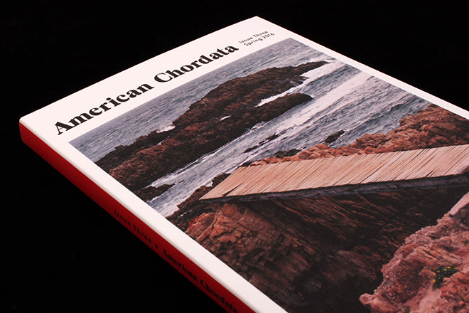
American Chordata #3
When you’re on holiday, there are two categories of magazines that you’ll probably buy and consume—there’s the Heat/Vogue/GQ/Monocle that you might flick through on the plane, and then there’s the pool-side reading that you’re going to give some time too—maybe it’ll be The New Yorker or The Paris Review.
This week’s Magazine of the Week is another title to put into that second category of languorous holiday reading, a literary magazine of new writing from New York that promotes fiction, non-fiction and poetry as well as art, illustration and photography. This Spring 2016 issue is American Chordata’s third release has just arrived in the UK, and if you follow our holiday recommendation and get hold of a copy, this is what you could spend a sunny day on the beach paging through:
There’s a collection of photographs by Neal Slavin (above), who spent his career taking pictures of large groups of people, and a lucid essay on pain and the body that’s juxtaposed with abstract oil paintings by Adam Sultan. There’s also fiction set in Manchester accompanied by the milky paintings of Brea Souders (also below), plenty of poetry from young writers and recent MFA graduates, and art by the great Ken Price, whose surrealist landscapes make an interesting interlude between the pages of a short story about trauma.
It’s one of the most image-heavy literary publications that I’ve come across, which adds an intriguing element to the title, but it perhaps goes a bit overboard as there’s something visual every few pages. These visuals can be an interesting distraction from the text, but at other times it distracts too much, and I prefer to imagine my own visual world for a story. I do love the title pages though, which make such a colourful splash (above) and feel so distinct—it sets the magazine apart from the more visually subdued literary magazines around.
At its best, American Chordata reminds me a bit of German photography and literature magazine Der Greif in the way that it makes text and image pairings, taking two separate pieces of art and juxtaposing them on the page to invite the reader to make parallels (above). The title is great for getting lost in and engaging with—it’s a beautiful first effort from a young literary editor starting out in New York.


