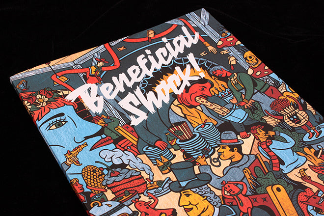
Beneficial Shock! #1
The arrival of a new magazine combining illustration and film inevitably draws comparison with indie hero Little White Lies. But with its launch edition just out, Beneficial Shock has immediately managed to set its own terms and agenda. This is not just another movie mag.
Launched by illustrator Phil Wrigglesworth and designer Gabriel Solomons, both of whom teach at Bristol School of Art and Design, it is bursting with powerful illustration. These range from Wrigglesworth’s debauchedly colourful front cover (that spreads across the back too, above), introducing the theme of the first issue, Food, to the monochrome realism of Gwion Christmas’s art accompanying a piece on cannabilism in the movies (below). Illustration is pushed to the fore throughout, given entire pages with most stories allowed multiple images to build on the visual power of the different styles.
‘Like other independent film magazines out there, we see the not using of stock film imagery as liberating rather than limiting,’ explains Solomons, ‘but what we think is unique about Beneficial Shock! is the way we commission illustrators with a commitment to informed research and long-term collaboration.’ This means treating writing and illustrating for film as you would literature, ‘The focus is on re-interpretation rather than literal translation.’ In some cases the editors even inverted the usual practice of commissioning writing followed by the art – the illustration was used as the basis for the article.
There’s also space for a photo-shoot: Martin Tompkins’ witty series of movie food references (above) shows how still life can act as illustration. Another highlight, and another different use of illustration, is Gary Embury’s reportage report accompanying an interview with a sound effects specialist about the use of food for movie sounds. The story leads with the art, the text added as a neat insert (below).
This adds a little pace, as does the ocassional spread of smaller works, like Jay Wright’s spread about film use of corn (above). And instead of ads, the magazine uses illustrated food-related movie quotes (below).
Food is a common theme for indies of course, but proves a strong source of stories when combined with film. The result is editorially exciting (though technically let down by the number of typos), and a strong kick off point for a series of great artworks.
Wrigglesworth worries about the softening of contemporary illustration work, the way that polished technique is valued higher than having a point of view. ‘It seems that students today are more interested in the presentation of their work than content being discussed within their work,’ he says, going on to quote Tibor Kalman, ‘When you make something no one hates, no one loves it.’
He hopes the new magazine goes some way to encouraging a move away from illustration as merely a mediocre decorative servicing industry. ‘We want Beneficial Shock! to be a magazine that affords us the opportunity to work with illustrators that share our philosophy and enable us to reclaim some of the creative space where exciting, innovative and informed work can thrive.’
The strength of illustration here as Wrigglesworth and Solomons press there point suggests they’ll succeed, and means their new mag is our Magazine of the Week.


