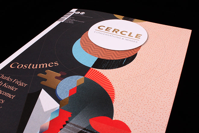
Cercle #4
Issue one was themed ‘Forget’. Issue two was then themed ‘Science Fiction’, and issue three was surprisingly themed ‘Insects’. France-based Cercle is an annual publication, and its themes have always been unexpected and different from what was produced the year before. What binds all the distinct issues together is rather the magazine’s persistent visual language, which is consistently blocky, graphically illustrative and geometric, and which conveys a vague sense of warmth, texture and three-dimensionality.
2016’s anticipated issue four is—unexpectedly (as to be expected)—themed ‘Costumes’. Costumes are interesting to the editors because they “impose a contradiction: we show, yet hide.” There are a lot of fashion journals that deal with the theme of disguise and identity but I rarely come across anything specifically related to costume and theatrical dress-up. Cercle’s approach is also refreshing precisely because it is not traditionally part of the fashion industry, so it’s come to the topic in a completely new and enticing way.
Issue four is more of an explorative field guide than an on-trend celebration of clothing, make-up and style. It’s precisely this unique outlook and approach that makes it our magazine of choice this week.
In the ‘Conversation’ section, Cercle speaks with famous costume designer Camille Assaf (one of the team members responsible for the clothes of the Beijing Olympic Games in 2008, above), and also a designer of intricate Venetian masks (below). The interviews are intriguing and lively; the only thing that lets them down is that the English translation feels quite sticky and occasionally broken. You get the feeling we’re missing something.
Cercle’s strength is definitely in its visuals. Firstly, the same illustrative hand from the cover runs throughout the entire publication, binding everything together in a beautifully cohesive way. Graphic drawings of more Venice masks in the miscellaneous chapter (above), small cut-outs of famous costume designs (also above), and enveloping illustrations covering the pages of chapter dividers (below) give the magazine an alluring sense of an ebb and flow.
The art direction is also strong and on-point. Masks by Studio Bertjan Pot (above), intense, Renaissance-inspired portraits by Christina Tagliavini (also above), and Björk-like creature-costumes by designer Nick Cave (below) take you to another world like a enveloping piece of theatre.
Other stand outs are the fiercely colourful illustrations of Stacey Rozich (above), and expressive, humorous paintings by Ryoji Nakajima (below).
Cercle is a ‘platform magazine’, and as we’ve noted on the Journal in recent months, there are an incredible amount of these kinds of publications—ones that showcase the work of creatives —being produced at the moment. Yet Cercle is a remarkably well-tailored and cohesive version: it’s annual schedule, careful curatorial approach to content, and holistic, well-defined sense-of-self places it at the top of the platform magazine league.
Editor: Marie Secher
Art direction: Cercle Studio


