

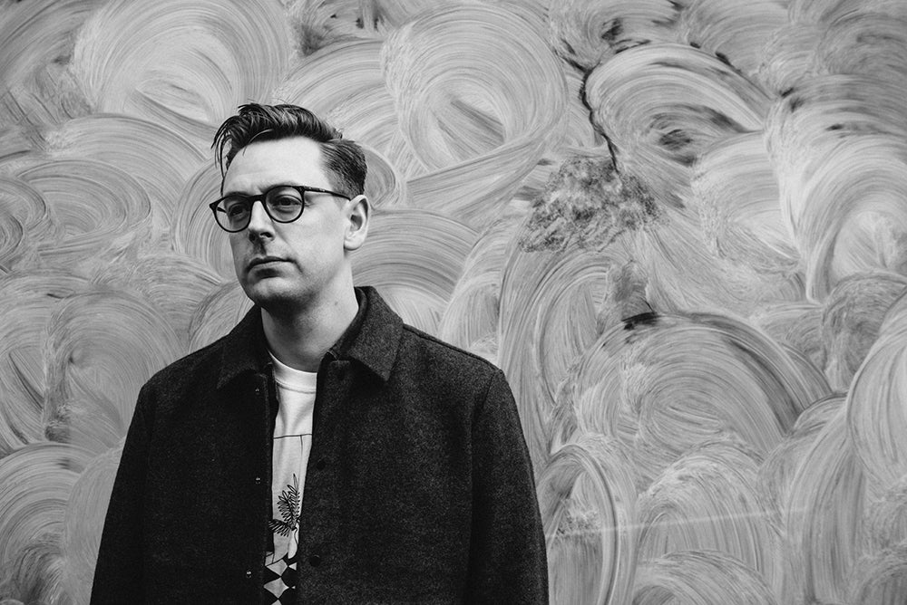
Chris Clarke, The Guardian ‘Saturday’
Chris Clarke has been with The Guardian for eight years, and has been integral to many key design developments at the newspaper, including the 2018 tabloid redesign (the last time we heard from him) and the 2019 Guardian Weekly magazine rethink.
As Deputy creative director at the newspaper, Chris recently led work on the launch of the new Saturday magazine; today he shares the thinking behind that project as he looks ahead at his week.
Chris is also co-founder of affordable art collective RoomFifty and bassist in noise punk band Modern Technology.

What are you up to this Monday morning?
Every morning I spend an hour walking around a forest local to my home in Leytonstone, east London with my son Rudy. He is awake most mornings at 6.30am (if I’m lucky) so I tend to be out of the house at 7am after a quick coffee. I’ve lived here for eight years now and formed a sincere love for this forest, and more intimately this routine since the pandemic struck.

Today I’m writing from our office that overlooks Regent’s Canal in the heart of Kings Cross. Monday’s are typically busy for me, with meetings back to back all morning. Often finding myself darting from topics on news to features to management at the turn of a dime.
This afternoon we have a big forward planning meeting on the magazine—lead by acting editor Ruth Lewy. We work through the features list for the current issue, with pictures, production, digital and design feeding in on any updates. A little later on we have an ‘creative’ specific meeting, where we drill down a little deeper on ideas, concepts and directions for up-coming stories.

Describe your desk and your work space
Since the pandemic, The Guardian has moved to a clean desk policy—meaning no personal items can be left at a desk. This is something quite alien to me, as I’m usually found with my head just above the precipice of a wall of books and magazines that surround my desk.

At home, I have a remote setup that logs me directly into a machine at The Guardian. This has been invaluable not only during the pandemic, but for working on any late, or breaking news stories, where we can have input immediately, rather than having to lose an hour commuting into the office. We use a digital flatplan built specifically for The Guardian that allows us to check the status of copy, furniture and layouts. It’s incredibly collaborative, and transparent—and utterly vital.

Often on a Monday I tend to work from home but have decided to come into the office to proof images for an upcoming feature using our in-house imaging room. We have a really special issue planned for the 23rd of October, where the photo direction has been 6-months in the making, and I’m keen to make sure they balance.

Which magazine do you first remember?
Thrasher—as a kid in the 90’s this was all I read. Looking back at covers of this magazine now, I’ve realised just how responsible it is for my love of obnoxious yellow highlights, which subsequently now plagues The Guardian’s design language.
What’s the first thing you do when told, ‘it's time to design a new Guardian magazine’?
I had just come back from paternity leave when I was told about the project. Rudy (my then four-month old son) was enjoying the dizzying intoxication of sleep regression, and I was briefed to design a proof of concept for the magazine to go into user testing in under a month.
Still with pandemic restrictions firmly in place, editor Merope Mills and I shared a closed off room upstairs In The Guardian for just under four weeks, producing a first iteration of the magazine that would be researched up and down the country in various focus groups.
I always approach these projects in the same way. Diving into the archives, to get a real feel and understanding of what’s been before, and to look for motifs and inspiration that could be re-appropriated in a new context.

In this instance, inspiration struck in the form of a newspaper a-board from the 1970’s that hangs outside the editor-in-chief, Katherine Viner’s office (above). This sign with it’s bold condensed sans-serif typography urgently cries ‘Now more than ever, you need The Guardian’—a sentiment that couldn’t be more critical today, and was largely the inspiration for using a condensed sans-serif typeface within the magazine.
From the beginning of the process we knew we didn’t want the magazine to be restrained — and opted to work with the largest format available to us which reduced overall waste in the process.
Designing a magazine of this size you tend to design it as a kit of parts, with modular layouts for stories and page styles. Structurally a horizontal grid underpins the pages, with furniture, images and eyelines occupying various multiples of these horizontal modules. This meant that regardless of who was putting it together, there will always be familiar type sizes, alignments and picture sizes that are consistent throughout the magazine. Approaching it this way also meant that when ideas changed — which they did often, you were able to provide a solution fairly quickly, that could be tested with readers — which was essential in working to a project of this speed and scale.
The decision was made early on to utilise the size of the magazine to be bold and dramatic in what we commission, giving space for photography and illustration to breathe where possible. This is where design is integral to the flatplanning of the magazine, and editor Merope Mills and I went through several iterations of the structure until we landed on a magazine with the right flow and pacing that gave areas to breathe but also allowed for density as a point of contrast.

Describe Saturday in three words
A.BIG.MAGAZINE

The change to The Guardian’s range of Saturday sections was billed as a cost-saving exercise by some, yet the result feels the opposite. How did you manage that?
Fortunately, it was never put to me as a cost-saving measure, and from the original briefing it was always spoken about excitedly and in platitudes of innovation. This positive briefing meant we felt boundless when approaching the design.


We knew that making the decision to drop our magazines would be one met with disappointment for so many—and it was this concern that really stoked our enthusiasm to get it right and give readers something exciting, and importantly relevant to read.


Visually speaking we’re aiming to be limitless in what we commission. With the previous magazines closing, we now have the full strength of our award winning picture editors and designers all in one place. This makes for really electric ideas meetings, underpinned by a real sense of excitement and enthusiasm that comes from working on a new project.


We’re also aiming to approach our commissioning from a point of authenticy. In the instance of Greta for our first issue, yes she was actually covered in an oil and paint mix. With Jeremy Strong, yes we actually did set a man on fire and retouched his suit onto him. It is this level of detail that I hope doesn’t go unnoticed, and hopefully adds to a level of authenticity.

The 2018 tabloid redesign of The Guardian established a new visual language for the newspaper and website.
The Guardian’s visual language has stuck resolutely to a single distinct direction across all channels since the 2018 redesign; Saturday heads in a new direction. Is this the start of something new for all future channels?
Creative director Alex Breuer and I sat down and chatted about the possibilities for this magazine early on in the process. It was felt that we were at a stable enough position with our brand language that we are able to depart from our core typographic language and expand on our palette.
Bold times, feel the deserve a bold typeface—and we opted for Titling Gothic Skyline that in stature, aims to reflect the bravery, and dynamism of our journalism.
Although new to our current typographic family, the use of condensed sans-serif typography is not completely new with The Guardian’s rich history. The sign, as previously mentioned is one example — and looking back through the archives there are instances of similar typefaces appearing throughout the decades.

We also looked for inspiration in the great magazines of the 70’s / 80’s that shared a similar large format. You will notice aspects from this period of magazine design woven throughout the ‘Saturday’, from the ruled justified columns of type, bold and dramatic uses of photography and really utilising the scale of the magazine to create moments of drama.
What are you most looking forward to this coming week?
Putting the final touches on a special issue we have been working on ahead of Cop26. As mentioned previously it’s been several months in the making and hopefully goes some way to demonstrate the full might of the editing and creatives teams that now work on this magazine.
Editor: Merope Mills
Acting editor: Ruth Lewy
Creative director: Chris Clarke
Art directors: Maggie Murphy, Sara Ramsbottom, Suzanne Lemon
Picture editors: Kate Edwards, Caroline Hunter, Louis Siroy
Picture assistant editors: Amparo Escobedo, Sarah Smith, Rowan Righelato
Production editors: Grainne Mooney, Andrea Chapman
magCulture Live 2021
Alex Breuer, Creative director of The Guardian, will be presenting the development of the Saturday magazine at the London edition of magCulture Live on Thursday 4 November.
Find out more