Detailed
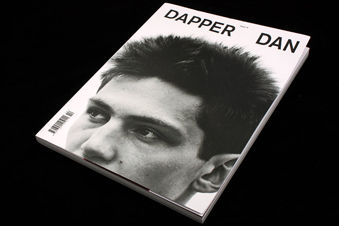
Dapper Dan #14
We like to take an in-depth look at magazines here on the Journal, but sometimes a small thing needs to be noted. I’ve had this magazine sat on my desk for a few days now, and it keeps grabbing my attention, which is exactly what a front cover should do.
Dapper Dan has always limited itself to monochrome covers, but this latest issue is even more strikingly simple. The confident, tight crop and trim, the model’s bog brush hair and the slightly open word-spacing on the two-word title make this a really powerful front cover.
Photograph of Willow by Johan Sandberg, art direction and design Omar Sosa.


