

Erik Spiekermann, typographer and designer
Erik Spiekermann is an ever-present figure in modern graphic design, known as much for his witty conference presence as for his typefaces, wayfinding systems and editorial designs. He recently opened p98a, an experimental letterpress workshop in Berlin, where he offers workshops as well as producing his own publications including the p98a Paper.

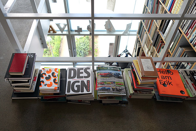
We asked him to select a recent magazine, an old magazine and one other thing…


A new issue: Eye
My perennial favourite has to be Eye. Not only because I wasn involved as German editor when it was first planned 25 years ago. They’re now on issue 93, volume 24. Each issue is set in a different combination of typefaces and has managed to keep its character over a quarter of a century – exactly because they’ve been changing all the time, while keeping their writing and editing at the same high level. I don’t know of another design magazine that has been writing about our industry/trade/business at such a consistently high level, while keeping the layout up-to-date.


An old issue: Matrix 33
My favourite old issue is Matrix 33, A Review for Printers & Bibliophiles, simply because I haven’t been able to get a newer issue. It is a totally anachronistic enterprise: all set in Monotype metal type by The Whittington Press in Herefordshire, England, and printed letterpress on a Heidelberg Cylinder. Only 750 copies exist and if it wasn’t for the number 33 on the cover, it would be a book – 176 pages, bound in stiff covers with a dust jacket. Illustrations and paper samples are glued to some of the pages or bound in. A method that can only work because it’s all done by hand and couldn’t be applied to a run of a few tenthousand copies.
The content is similarly eclective, from articles about the history of printing, typesetting and publishing to adventures like Nick Hand’s journey from Bristol to Mainz on a bicycle equipped with a small printing press. Enough material to read for weeks and a reminder of where typography comes from. It takes a lot of love to produce a magazine like this and that love shows on every page.

And another thing:
Letterpress; as a printing process it survived because it became a hobby thing and a hipster activity. They use polymer plates to get that deep impression which would destroy metal type. Now at p98a (above) we have developed a method to produce metal-backed polymer plates without first having to make a negative. Direct to plate, up to 52 by 72cm, so eight book pages at once. The best of digital typography combined with the best method to get black type onto paper. It results in a slight bite of type into paper, not a deep debossing, but it achieves what Adrian Wilson* described:
It is the refraction of light
in the well of impression
that makes relief printing
spectacular.
We are printing Louis Rossetto’s (founder of Wired magazine) first book about the story of Wired and the digital revolution in 1998 San Francisco using that method. There’ll be a Kickstarter project coming out on July 18.
*Adrian Wilson (1923 – 1988) was an influential book designer, and author of the classic 1967 work entitled The Design of Books.