Esopus #23
As we’ve noted a few times, the platform magazine seems to be everywhere right now. One that’s been around a little longer than most, and that can boast some of the most august art contributors, is New York-based Esopus.
Published biannually since 2003 (but now an annual), Esopus is published by the Esopus Foundation, who take advantage of the genereous US not-for-profit 501(c)(3) tax scheme to publish their magazine unmediated, ie without advertising. The result is a unique publication that can dedicate long runs of pages to single art projects, and do so with great attention to production and finishing.
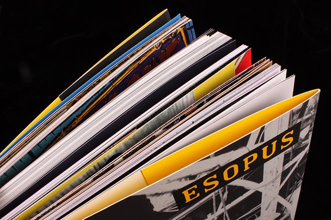
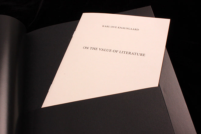
This is clear from first sight of the latest issue 23; as our main image shows, it carries multiple inserts and folded sections. Immediately after the opening pages of contributor notes and acknowledgements – it’s like an art gallery in more ways than one – the first insert features an essay by Norwegian author Karl Ove Knausgård (above); printed on crisp, smooth white paper, it sits in a folded pocket of jet black card.
The next pages feature Marilyn Minters’ images, beautifully printed and including a tracing paper insert (above) that shifts the piece from reproduction art to actually being art.
The next artist’s project, by Mickalene Thomas, goes to town with die cuts and cut-down pages (above), and between these two projects a visual history of the outdoor garden at MoMA is enriched by the inclusion of a copy of a 1971 invitation to the space.
The sheer richness and variety of content is almost overwhelming at times, as the issue switches from stills from Lotte Reiniger’s 1920 animated film ‘The Adventures of Prince Achmed (above), to Karo Akpokiere’s comic art (also above) via a collection of anonymous found images (below). Each story is given sufficient space to play itself out, and the pacinsg and shift in gear throughout is well worked.
Later, a lengthy written story about ‘The Long Dark’ video game is followed by in-depth background visuals that fold out (above), adding a guide-like feeling to the section.
These are just some of the highlights of this 250-page colossus of a magazine. Esopus takes the concept of ‘magazin-iness’ to new heights, every element has been lovingly considered and every part has its own identity – there is no grid, typographic style sheet or colour system present. Yet it holds together as a unit. After 23 issues it’s riding an absolute high.
Editor: Tod Lippy


