

Fantastic Man #29
The 29th issue of Fantastic Man sees this leading light of the indie world continue to develop while maintaining its distinctive vision of what a magazine should be.
At a content level, the magazine can be regarded as the same as it’s ever been; it continues to celebrate a particular type of man — the international, creatively-orientated, liberal if you like. But to maintain that strict vision over 29 issues shows that the team are as adept at managing their subjects to match their vision as they are at sourcing easy matches.
Fantastic Man arrived as a fully-formed concept in 2005 and has maintained a distinct vision all these years. It’s not been a perfect arc; on their 10th anniversary the logo and cover went awry for an issue, but since then the magazine has regained its composure and become stronger for that hiccup.
Great magazines establish their own, distinct worlds, and Fantastic Man is in full control of its identity as a space to lose yourself in. The creative team make this look simple, but the many awkward attempts to mimic their magazine show the opposite is the case.
What I’ve always loved about it is that it functions well both as publication in its own right and as a critique of what ‘magazine’ means. Its editorial concept and austere design aesthetic are often, rightly, noted but its the broader oversight of each issue from a flatplanning/pacing point of view that is the key to its identity.
All magazines should be conscious of their running order and the variation of content from story to story, but the Fantastic Man team take this to new levels. From that first issue, the basic feature story grammar of opening picture/headline/intro/text was broken down into its constituent parts and rolled out at their own pace using a written language that made clear, without stating it explicitly, that the featured interview subjects were, indeed, ‘fantastic men’.

‘Mr. Malcolm’ was a typical opening title of an interview in that first issue, followed by the surname ‘McLaren’ and the introduction, all in caps, ‘The quintessential Englishman in Paris might take Hollywood, Berlin and Milan by storm with some bloody interesting new projects…’ Set in Times New Roman, this filled the entire opening spread; the ellipsis encourages the reader to turn the page to discover a portrait and first page of text across the now familiar three-column grid, clearly defined by vertical rules (below).

Every decision behind these pages is clear and deliberate; the opening spread is an announcement, and the slightly coy tone (‘might’) of the writing is in contrast with the shouting volume of its presentation. There is no overt decoration, only words and pictures, structure and pace. We are left in little doubt that Mr McLaren is a fantastic man, but in case not, the addition of a running head repeating the magazine’s name emphasises the label. The entire aesthetic is born of Creative director Jop van Bennekom’s singular design vision, and can be traced back to his early work on the experimental Re- magazine project.
The same approach is applied rigorously across the entire issue, a direction the magazine has maintained ever since, using different combinations of those same basic components. They are playing with the conventions of magazine logic.

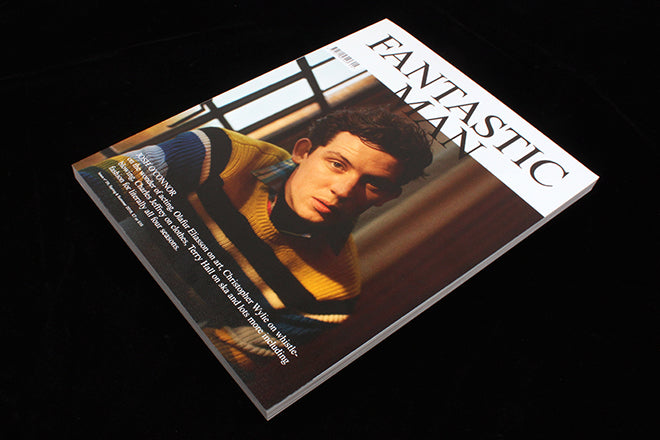
The latest issue is no exception. This opener to an interview with singer Terry Hall (above) follows their latest, particularly satisfying, template. Text is reduced to a minimum on the opener – just a headline and the subject’s name. And the headline is now merely a symbol for headline; while unavoidable with its bold red capitals struck across a portrait, it is difficult to read as the scale of the letters mean the words are broken up.

But the smaller name-check for the subject of the interview is really all we need, and there it is as the bottom of the page. The trick here, the linguistic fun, is that the attached asterix encourages the reader to look for the attached footnote, which arrives after the page-turn, where we find a list of Terry Hall’s roles (below). This latest device is super-clever, combining essential description (‘Singer’) with editorial opinion (‘Instigator’). Classic Fantastic Man, it is at once beautifully simple, ever so slightly pretentious, yet effective.
There are plenty of other details to coo at here; the way the running heads and folios switch between B&W and colour according to the content of the page they sit on; similarly the way the typeface of the same furniture flips between serif and sans serif depending on the nature of the page.

One last point, also related to the Terry Hall interview. The magazine can now attract great writers and there are always surprises. I have no idea whether music writer Peter Paphides has written before for Fantastic Man but his name might not immediately seem a neat match with their world. Yet here he is, adding his experienced voice and, according to a recent tweet, thoroughly enjoying being given a decent wordcount to interview Hall.
For all its design chops, Fantastic Man (and its sister The Gentlewoman) deserves recognition for its interview prowess too.
Editor-in-chief: Gert Jonkers
Creative director: Jop van Bennekom