

Footnotes #A
We’ve seen a few heavyweight tomes arrive at magCulture HQ recently; last week we featured the new Alpine Review, a 306-page wonder, and the 232-page second issue of HOLO is awaiting attention. But this week’s magazine of the week Footnotes is from the other end of the scale spectrum, a mere 52 pages.
At a time when discussion and criticism of graphic design has become broader but too often shallower – so much is easily available online without any context or analysis – we need design magazines that dig a little deeper and remind us of the deeper side of graphic practice; exactly what Footnotes does.
Published by Swiss typographer Mathieu Christe from his La Police foundry, this small magazine is for the typographic obsessive. What I particularly like about it is its relationship with time and (type) history. An extensive piece about typewriter typefaces highlights a lost period in typesetting, one I remember from Uni. In the sixties and seventies IBM and Olivetti both manufactured typewriters with changeable typefaces, an early precursor of DTP.

The extensive collection of typewriter samples in Footnotes is backed up by a reprint of an introduction to the faces by Alan Bartram, taken from Herbert Spencer’s Typografica magazine.

The theme is further developed with a case study of Atelier Carvalho Bernau’s typeface Josef, based on Olivetti’s Candia typewriter font (above).
The magazine is well-designed, making use of the typefaces it discusses and rich in useful detail: footnotes play a key role in editorial and visual content and it follows the modernist ideal of little decoration or adornment beyond the content itself. And just red and black, naturally.

Footnotes is neatly positioned between two poles: at one extreme is the absolute type obsessive for whom much of the content will be familiar but enjoyable, at the other the young designer scratching around for context. It fits this role perfectly – well-researched, enthusiastic and engaging.
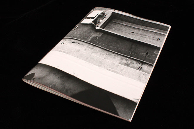
Against all this sober typographic investigation, the front cover image might seem obscure and out of place. It’s actually sourced from a police case investigation, forensic science being a field where letterforms are studied (using The Haas Typewriter Atlas & Catalog) in order to identify documents. For example, a threat letter or a ransom note.
We’ve chosen Footnotes as our magazine of the week to remind us how publications can succeed at any physical scale. We love both them small or large – it’s the quality of the overall entity (text, image, design, production) that counts.
Footnotes will be appearing annually, with issue B due mid-2017.