

Hole & Corner
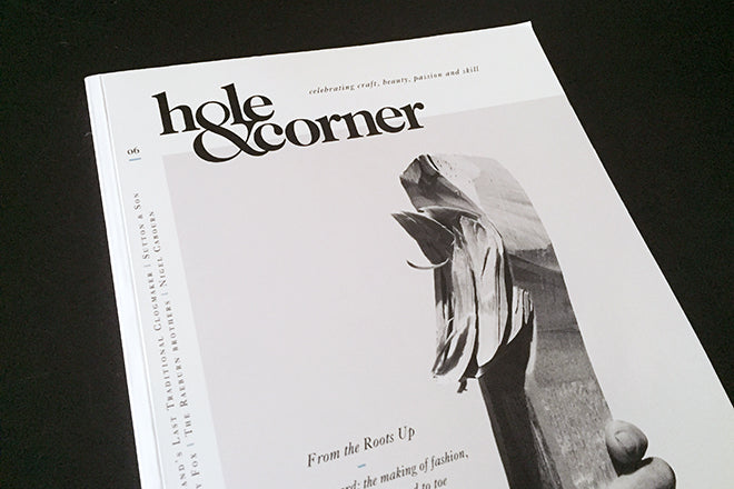
The latest Hole & Corner is the fashion issue, offering a unique perspective on some of the big names in style without losing sight of their passion for substance. As a magazine about craft and skill, an interview with ‘the last clogmaker’ in England Jeremy Atkinson might almost seem parodic, but he fits in alongside Philip Treacy and Nigel Cabourn, and contributors including Simon Foxton, Kevin Braddock and Nick Compton add sound editorial experience to the content.
The magazine has quietly built a reputation and audience over its six issues; it already feels as if its been around forever (in a good way!) and earlier this year raised a significant £200k via Crowdcube to help expand. Since its beginning it has always appeared as a solid, perfect- bound and weighty publication. And part of this success is its design.

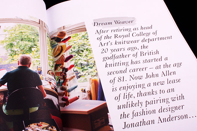
Last time we mentioned Hole & Corner we were distracted by the headlines all being taken from David Bowie songs. But to call them headlines is to miss the point. The main visual at the start of each feature is made up of two simple parts: first the typeface is Caslon, that most British of serifs and distinctly unfashionable.
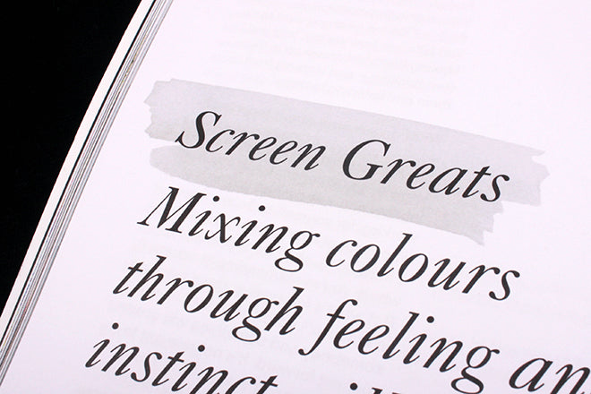
The second element is the way the headline is picked out at the front of the intro; using the same font and size, it is identified each time with a brush of watercolour paint. Although these brushstrokes are real, they’re reproduced in black and white and so become symbolic rather than an attempted trompe l’oeil effect.
The quirky Caslon italic and the watercolour effect provide the signature identity for the magazine: clear, intelligent and recognisable, speaking calmly of Britishness and the hand-made.
Editorial & creative director: Sam Walton
Editor: Mark Hooper
An earlier version of this article mistakenly identified the typeface as Baskerville.