Illustrating Pit Magazine
Art director Holly Catford has worked on a wide range of magazines as part of Simon Esterson’s studio and in her own right; her work includes Eye, History Today and Pulp and she also designed Noble Rot with us at magCulture. Last year she was part of the team that launched Pit magazine, ‘about food and fire.’ Holly is a consistent and passionate user of illustration, as Pit demonstrates every issue with its illustrated front covers. I spoke to Holly about comissioning and working with illustrators.
Issue three cover by Eleanor Shakespeare
Do you reserve the use of illustration for when a subject is hard to shoot, or do you allocate a number of stories to be illustrated each issue?
When we put together the contents list for each issue, I tend to know pretty quickly if it s story’s going to need an illustration or photography. If it’s a recipe or profile, I’d rather stick with photography. I’m probably a bit traditional in that if I’m going to make a recipe, I like to see a proper picture of it.
When the subject is like how to control your BBQ using airflow like in the ‘an air of importance’, it only seems sensible to commission an illustration. For that feature I wanted something a bit funny, so I asked Caspar Wain to work on it (above). This is the second time we’ve worked on Pit together, he’s really amazing and very talented.
How tightly do you brief the artists? How many iterations do you anticipate?
I’m extremely lucky to deal with a lot of very talented illustrators, so I don’t brief tightly. I believe very strongly that it’s the illustrators job to come up with the idea, not me. I try and make sure they don’t fall into any obvious holes, like making sure they know what type of BBQ they should be drawing from the beginning.
What’s the most important part of the commisioning process? And the most common mistake?
The most common mistake is telling people what to draw! You’re commissioning someone to come up with a visual interpretation of the written piece. This is what they do all day long. I think a lot of people get a bit precious about style, but really it’s the idea that matters the most.
Do you select an artist looking for them to recreate a typical example of their work, or hope for a related but new direction?
I’d hate it if an illustrator thought I was just asking them to rehash something they’ve done before. David Biskup (who illustrated the sipping whiskey and rye piece, above, and below as it appears in the issue) messaged me to say he’d done something a bit different for his piece. That was really exciting. That’s what it’s all about. Having a close relationship with everyone you work with is really important. I’m really lucky that I actually know quite a few of the people I work with, from uni or just working together. It’s a collaboration (horrible overused word sorry), which makes it so much better.
How does managing illustrators compare to managing photographers?
I find it a lot less stressful, with photography you only get one chance to get it right. With an illustration you do get to have a bit more thinking time to get it perfect. The money is also a bit simpler. I can just budget for illustration (as we pay all our contributors in Pit), rather that sometimes photography can go over budget with travel and hiring stuff.
The goat illustrations by Ian Wright (and shot by Ed Park, above) was a combination of both. It was complicated to get Ed and Ian in the same place, and using fresh produce meant it had to be shot straight away. Even though it was stressful to get done, it was really worth it. They’re probably my favourite things we’ve ever published. Ian is a genius!
Do you think enough magazines make the most of illustration?
There is a lot of illustration around, but I don’t think everyone makes the most of what illustrators can do for a piece.
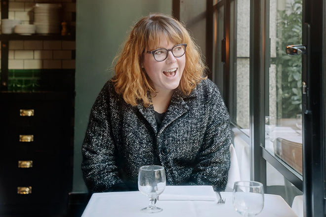
Portrait of Holly by Orlando Gili


