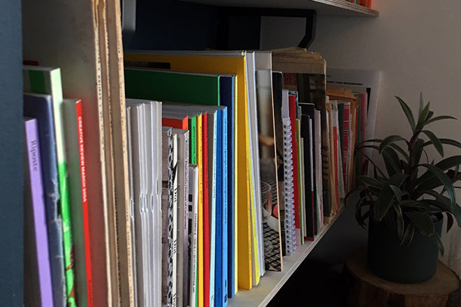
Tom Etherington, designer
This Friday, we comb Tom Etherington’s shelves. He currently designs book for Penguin Press, the specialist non-fiction and classic fiction extension of Penguin Books. Alongside the book work he also designs Penguin’s The Happy Reader magazine, in collaboration with the Fantastic Man team. Tom previously worked at Rankin Photography where he designed photography books and the fashion biannual Hunger.

We asked Tom to dig out out some favourite magazines – a new one and an old one, and one other magazine-related item.
A new issue…
Lunch Lady – I’m not a parent or a child, but I still love Lunch Lady. Such attention to detail and playfulness has been poured into it, like the beautiful paper aeroplane nets in the latest issue and the cooking utensil logo on the spine that changes every issue. Lunch Lady has such a distinctive character, it’s always a joy to flick through.
…an old issue…
Le Gun – I first found out about Le Gun, the magazine and art collective, when the members came to my art college to do a workshop. When they arrived, they were all dressed in oversized tweed suits, stinking of vodka, clearly arriving straight from a party. They proceeded to explain that they live in a skip in Soho and go around newsagents selling their magazine from a large purple suitcase.
I remember thinking, this is what I want to do with my life. The magazine itself is a large, mostly monotone miscellany of art, illustration and short stories. There is an open submission each issue and the likes of Alan Kitching, Peter Blake and Andrzej Klimowski are contributors. For me, Le Gun encapsulates why I moved to London as a student – eccentric artists, wild parties and outlandish art projects.
…and another thing…
Marin Visions – a typeface. It's a modernised and reinterpreted version of Marvin, which was designed by Michael Chave in 1969. Marvin's bold art deco style made it popular with science fiction paperbacks in the 70s and 80s. The new digitised, re-interpreted version 'Marvin Visions’, was created by Mathieu Triay and will be used on his forthcoming literary science fiction magazine Visions, which is launching soon. This promotional postcard using the typeface was designed by Matthew Young.
penguinrandomhouse.co.uk/publishers/penguin-press
Twitter: @_TomEtherington


