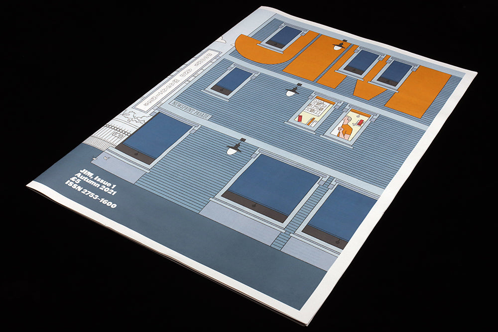
Jim #1
We love a surprise here at magCulture, and last week one turned up inside a poster roll; new broadsheet Jim turned out to be the return of Gym Class.
If you don’t recall Gym Class Magazine, it was a continually on-off publication from London-based designer-illustrator Steven Gregor, who shared his passion for magazines via his mag. It had apparently ended a couple of years back, and was sorely missed. Until now!
Now relaunched as Jim—say the name out loud to make the connection between old and new—the issue features a typical who’s who of current editorial names. Steven interviews editors and art directors from across the UK scene and jumps to the US to give us a taste of New York too. To put it simply, if you love magazines and enjoy our coverage here on magCulture, then Jim is for you.

You can find some hints at who’s included in the magazine from the illustrations in the issue, some of which we share here.

Steven created the series of images himself, starting with the cover image. While the issue has a strong visual identity based on the use of Commercial Type’s Original Sans font, it’s the illustrations that pull it all together, each interview being accompanied by a clever visual nod to the subject—the Monocle café coffee cups, the Man Fanastic T-shirt, the Pit balloon sausage cover… what else can you spot?

It’s a lovely synthesis of text, image and design, highlighting Steven’s shift from editorial design to editorial illustration and further expressing his passion for magazines. It also reminds us of the potential for illustration to do more than just brighten up the page—here it actively engages with the content and underlines the wit and knowledge embedded in the project.

And perhaps that’s Steven, there on the front cover, examining a page proof alongside the flatplan on the wall behind him?
instagram.com/ilovechickenkiev


