Luncheon #1
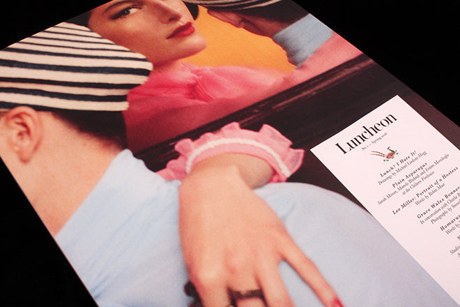
Luncheon is a new food magazine that structures itself as a meal; the contents are in menu form on the front cover and the sections are titled Hors d’ouevre, Main dishes, Classics and Desserts. It’s a cute idea – structure is important and if you can relate it to your subject all the better. But what really makes this new London-based launch stand out is its scale, physical heft and the nature of its contributors.
Appearing in an almost impractical 270 x 380mm format Luncheon is immediately impressive. Only Holiday can currently compete with it; the other magazine that comes to mind is the late Acne Paper, so it’s little surprise to find one of the prime movers behind the new mag is Thomas Persson, creative director of Acne Paper.
From Solve Sundsbo’s beautiful front cover image on, what impresses about Luncheon is its timelessness. The soft, fifties fashion feel of the cover image and the care of taken of its reproduction set the tone for the whole issue. Imagine the exact opposite of a sharp, contemporary experimental publication – this is it, the coming together of some great experienced practitioners to celebrate their respective editorial skills. It could easily be mistaken for a classic copy of a fifties magazine, something exagerated further by the use of a beautiful Fedrigoni off-white matt paper.

Like Victory Journal, photographers and illustrators take full advantage of the huge pages. Paulo Reversi is given 12 pages for a stunning shoot featuring headpieces by Julien d’Ys (above and below).
Michael Lyndsey-Hogg presents a glorious set of drawings of friends at lunch (above), reproduced full size and absolutely strong enough to each hold a page.
It’s not a magazine of design fireworks; if you knew Acne Paper the typography and grid will be familiarly simple but effective. But occasionally there is a visual surprise beyond the content itself, as with Judith Watt’s piece about the lobster in fashion (above); I love how the headline out of red reads across pages separated by black and white illustrations.
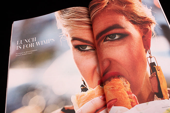
Scale is used again for Roe Etheridge’s startling ‘Lunch is for Wimps’ shoot (above).
There’s plenty more in the issue, including a piece about artist John Kayser’s bizarre series of photographs of women posing naked (above); a lengthy but enjoyable record of a lunch conversation between Comme des Garcons president Adrian Joffe, Paulo Reversi and Julien d’Ys (again); and another lunch chat between designers Manolo Blahnik and Erdem and fashion editor Sarah Mower.
That of course is the theme of Luncheon – friends sharing over lunch — and the magazine makes great use of its many friends; the editors are shown on the opening page shot by Lord Snowden, and there are a number of family links between the makers and contributors.
All of which could easily have left Luncheon an unpleasant, closed world of self-congratulation and in-crowd crowing. That it avoids doing so is down to the quality of the contributors; almost every one is a multi-disciplinarian at the height of their abilities, and the resulting magazine is something very special.


