

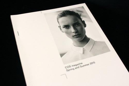
Magazine of the week: COS Magazine #16

With client magazines, the true test of their worth is in determining whether the brand’s identity has been properly extended and translated into the printed format. That’s why the latest issue of COS’s magazine gets top marks: for a brand that puts so much care into their choice of materials and which champions clean-cut design, it is appropriate that they so clearly do the same for their magazine. Produced by the publishers of Fantastic Man, the 16th issue is entitled ‘On paper’ – a theme that relishes the tactile and visual pleasure of the printed page. It’s a concept that reflects that same attentive engagement with fabric and subtlety which is the defining trait of COS’s luxe but minimalist aesthetic.
As art director Veronica Ditting shares our studio space, we’ve been lucky enough to talk to her about the new issue. She describes the format of the issue as ‘a simple stack of six papers with an exposed spine’, a description that belies the complexity of the production process. ‘Binding methods which aren’t standard directly become a production challenge’, explains Veronica, ‘It took quite a bit of back and forth with the printer and binder to figure out a machine process for the binding of the magazines.’ The result is a stapled binding, ‘We had a lot of paper dummies produced, to help us determine the type, colour and structure of the glue and the exact position and length of staples in relation to the grid and layout’. Even how the magazine would be packed had to be considered, ‘in order to avoid staple scratches’.
In the COS shop in Covent Garden, the magazine is presented neatly, and a little proudly, stacked up by the entrance, almost blending in with the white shine of the counter, looking like it’s always been there (which is a good sign). The two staples that bind the pages together emphasise its paper format. Sitting down on one of the wooden benches upstairs, I sift through the pages carefully like I would the clothes hung on a COS rail. The experience is very much the same, sampling lines, material, touch in order to make a choice. These are some of the design elements that most strikingly stand out:

Every 16 pages the magazine deftly changes its paper stock, transitioning from sections of UPM Fine bright-white paper to shiny Lumigloss to Munken Print Cream, a paper usually associated with books. Sometimes this mix works with the content – for this interview with novelist Taiye Selasi (above), her portrait appears on high gloss, the text on bookish Munken. Attentive details like this permeate throughout the publication. ‘The print quality that can be achieved is different on each paper. While in other cases one would be trying to hide that, here it was in our favour,’ says Veronica.

In the same way that a COS garment juxtaposes similar colours but different textured fabrics, this amalgamation of paper types celebrates the tactile nature of print. Information about each paper stock is discreetly and effectively placed along the edge of the page (above), echoing the clothes credits elsewhere.

It is a brand magazine, so each of the shoots naturally focus on COS products. An accessories editorial shot by Jason Evans is shadowy and abstract, almost like the photography of Moholy-Nagy, and the sharp lighting emphasises the textures and geometricity of each product. The blank space cut into the middle of the spread accentuates the curve of the open pages (above): the editorial design ensures that it’s not just the product’s form that is depicted, but the publication’s own shape as well (and note the different paper stocks).

Deep blue pages offset the primarily monochrome colour scheme of the issue to create delicate variation; each of these six blue spreads feature a work created from a single square metre of white paper by a different ‘enquiring mind’. Such minds include designer Julia Born, architect Anne Holtrop and industrial designer Khalid Shafar.

The printers crop marks that decorate the pages throughout are also emphasise the theme (above).

The deliberate alignment of images within the columns of text is seamless and precise, just like the sharp and distinct lines of the buttons along a COS shirt.

And interviews with Sylvia Whitman of Shakespeare and Company and Linder Sterling (photographed by Wolfgang Tillmans) are very smart editorial choices that suggest that the brand is positioning itself as a product for intellectuals, artists and thinkers.
These refreshing and authoritative editorial selections are as imperative to the sense of brand identity as the aesthetic. The magazine’s content and design is perhaps the perfect example of how a brand can elegantly use the printed page to promote and engage with its clothing counterpart.
Review by Madeleine Morley