Magazine of the Week: uncube #32

If like us you’re tired of digital magazines desperately trying to mimic print – all those flickable pages and paper-turning sounds effects – you’ll enjoy architecture journal and digital magazine uncube. Instead of of trying to recreate the print experience print they start from scratch with a clear editorial approach, re-imagining what a magazine could look like in the 21st century, and crafting their content on a limitless, digital canvas, using multi-disciplinary media as their paint. We don’t choose an online project as Magazine of the Week lightly – uncube is special.

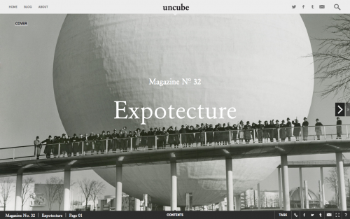
Like a print magazine, uncube has a contents page that allows you to jump between articles, but being digital, the user-face responds to where you hover the mouse (above). The new issue of uncube is themed ‘Expotecture’, and it brings together a collection of essays and features centred on the upcoming Expo season. A thematic approach is integral to the concept behind uncube, as editor-in-chief Sophie Lovell tells us: ‘Today it is totally natural to think, organise and consume information in clusters, so it seemed only natural that each issue would be clustered around a theme. If you are on a mission to break the magazine format, to rethink publishing, then it is not just the medium but the structure that has to come into question as well.’

Whilst the monthly magazine focuses on a single theme, the team at uncube also release content into the blog section of the site (above). Some posts do relate to the monthly theme, but other articles head elsewhere. This way, uncube exists in several spheres: conversations continue to emerge and grow from an issue after its been released, but the blog also has a life of its own (emphasised by the fact that it has its own separate email newsletter).

Sophie has a background in print. At first she was unsure about paperless publishing, but after working on uncube, she’s been swept away by the potential that digital offers: ‘It is so fantastic to have all these possibilities, to be so flexible and far less wasteful in terms of energy and materials – yet still produce a high-quality product that has almost haptic qualities.’
Haptic is a good way of describing uncube – although it exists behind a flat and slippery screen, the moving elements that shuttle into place when you scroll horizontally give the illusion of a series of planes (above). This creates the appearance of depth, and the varying textures of the elements add to the three-dimensional quality and stimulate the sense of touch.

This sense of the three-dimensional is particularly useful in terms of the content that uncube covers: as an architecture journal, being able to evoke the physical reality of a building to a reader opens up a whole new set of options. Architectural criticism has suffered in the past by the fact that photography is static and unable to capture the entire surroundings of a building: works seem to exist in isolation, and it is difficult to evoke the atmosphere of an entire place through images alone. Through using moving image, uncube is able to eloquently articulate the context of buildings.
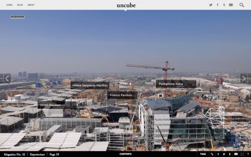
An interview with ‘Expotecture’ masterplan designer Jaques Herzog makes good-use of film clips in the middle of the feature (above): the screen seems to pan over the architectural site, allowing for the reader to virtually experience the space in a way that they never could with print.

Sophie cites another example of how moving images open up new possibilities: ‘In our Poland issue, there is a wonderful photo essay and moving text by the photographer Michal Szlaga about the Gdansk shipyards. It is a series of moving stills; super slow and incredibly beautiful. So we included it full screen. It is demanding of the reader because you have to slow right down and take the time to watch it – but it is very rewarding if you do.’
Scrolling through the essay and photographs of the piece, your tempo is slowed down dramatically, and the film is pleasantly languorous. Through words, sound, film and photography, this digital essay is able to transform you to another place, and it evokes time as dictated by the rising and falling of the tide.

uncube have approached advertising with the same innovative and multidisciplinary outlook as their content. Like the magazine, it’s a complete re-thinking, not just in terms of the format of print ads, but of native advertising as well. ‘Advertising, as it used to be known, is dying alongside the print magazines it inhabits,’ Sophie emphatically believes, ‘We can create full-page films, gifs, microsites within the issue. We are only limited in theory by what a web page is capable of containing – which means there are hardly any limits. The real issue is getting the clients to be brave enough to experiment with this potential.’ Their ‘showroom’ feature is perhaps an example of the integrated advertisement that they’ve been experimenting with (above): the design of the section differs enough from the rest of the magazine so that it’s not native advertising, but the brands showcased aesthetically suit the magazine and do not break from publication’s flow.
There is something organic about the way that you experience uncube, despite the fact that it’s an online publication. It’s an example of real innovation in the world of digital magazines, and it experiments with a range of exciting new multidisciplinary possibilities. Whilst in many ways the future of magazines is still in print, as so many projects showcased on magCulture demonstrate, uncube points to positive ways that we can look forward to a digital future as well.
Review by Madeleine Morley


