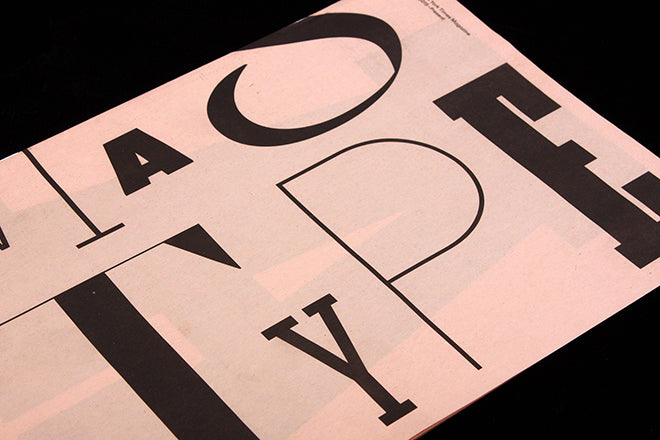
New York Times Magazine type speciman
Everyone reading the Journal will know how much care and attention The New York Times Magazine puts into its design and art direction; its what lifts its above so many other publications, and why it wins award after award (the latest being Best Editorial Design at the recent Design Week Awards).
If you’re lucky enough to be in New York this summer you can see an exhibition about the magazine and its typography, at the Type Directors Club until 5 September. Featuring covers and spreads from recent issues, the show focuses on the bespoke typography created for the magazine by Henrik Kubel of A2-Type as well as work created by the magazine’s in-house team.
To mark the ocassion, the New York Times Magazine studio have created a 40-page speciman showcasing the bespoke typography. Printed by The Newspaper Club, the small-format newsprint publication is a delightful reminder of the vital behind-the-scenes work that goes into making great magazines. As Gail Bichler explains in her introduction, ‘…it’s the way that typography and imagery interact the makes New York Times Magazine singular.’
Not everyone has the budget or scope to work this way, but that’s not the point. This typographic work is a powerful reminder of the standards we should all be seeking to match, be it in photography, illustration, art direction, page layout or indeed typography.
Design director: Gail Bichler
Art director: Matt Willey
Note the exhibition is free but by appointment only; check details on the TDC website.
We have a very limited number of copies of the speciman available via the magCulture Shop. As they are distributed free at the exhibition, we aren’t selling them. Instead, when you buy another magazine from our online shop please indicate in the notes section that you would like a copy added to your order. It is also avilable in store on the same basis. One copy per customer.
magCulture Boxset subscribers will all receive a copy with their next delivery, at the start of July.


