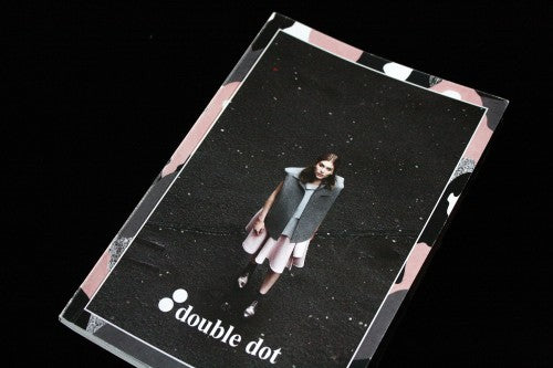
Out now: Double Dot #6

There are a lot of magazines at the moment that centre on cities, and it’s becoming difficult for publications of this genre to stand out and do something distinct. But pocket-sized Double Dot manages a fresh approach to the topic. For each issue, the Toronto-based magazine selects sister cities like Los Angeles and Vancouver, or Amsterdam and Montreal, and collates content that invites us to connect the dots and consider what makes up the special relationship between the two geographical points.
It’s a magazine for the age of Skype, Whatsapp and Basecamp – where freelancers work between two places with seamless ease. Many of the interviews are conducted online (and the write-up makes no attempt to hide this), and the content and aesthetics of the publication suggests a solid awareness of how the internet shapes the way we interact with other cities day-to-day. Features focus on art, culture and music, with editorials at the centre that concentrate on the distinct fashion trends of either city. A hilarious comic strip by Grace Wilson about struggling as an artist in expensive London is a particularly personal story, and it’s an example of the magazine’s distinctive content (above).
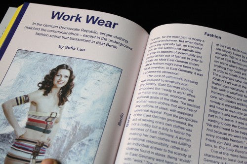
The magazine is split in two, one part for each city. The London half is defined by a strip of yellow along the page edges, and the Berlin section by blue (above). The London content is laid out on grey pages (also above) – the grey of rain clouds – with primary colour for text – a subtle nod to red phone boxes, green patches of grass and a general 60’s mod aesthetic. The Berlin section is electric blue with a pastel pink background (below) – the soft colour of the city’s apartment blocks. Straight lines hem in the columns of text, mirroring the linearity of Berlin streets and architecture. Further definition comes from the typography – London is represented by Times Roman, Berlin by the more functional Helvetica.
At the magazine’s centre, where the two cities meet, there are Google search auto-complete suggestions for both Berlin and London (above). The humorous juxtaposition invites you to compare and contrast, to think about what the city’s share and also what makes them exceptional and different.
The editors have a fine eye for contemporary illustration and graphics that matches their playful outlook. Visuals become a way to infuse the publication with a sense of a city’s movement as well as their own distinct and young personality. Graphic pull quotes for an interview with pop star VV Brown are particularly energetic, and they’re also evocative of the kind of layering that is popular in London’s fashion at the moment (above). Moving eastward, an illustration by the colourful Annu Kilpeläinen for a piece on David Bowie’s 1970s Berlin captures the fiery, anarchic charm of the city that is still very much present today (below).
Double Dot has a fun, zine-like quality about it: it’s what zines should look like in the 21st Century, where instead of glue and scissors, choppy graphic design is used to convey a sense of energy and youth. The A5 size makes it perfect for carrying around in your purse or backpack; ready for airport browsing when you jet (or dot) between your favourite cities. Like last week’s Mag of the Week Flaneur, Double Dot takes a new approach to writing about cities – instead of focusing on places to eat or drink or spend money, its interested in what makes a community special, and how cities interact with one another in light of the internet era.
Review by Madeleine Morley


