Out now: Kwintessens, volume 24 #1
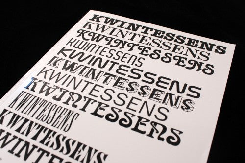
Design magazines tend to be designed in one of two ways, following either the minimalist’s golden rule of ‘less is more’ or ruling by the eye-grabbing dictum of ‘less is bore’. Brussel-based Kwintessens has published quarterly since 1992 by Flemish design promoters Design Flanders, and it emphatically falls into the latter category, opting for an aesthetic of mix-match typographic collages and bold Bauhaus colours.
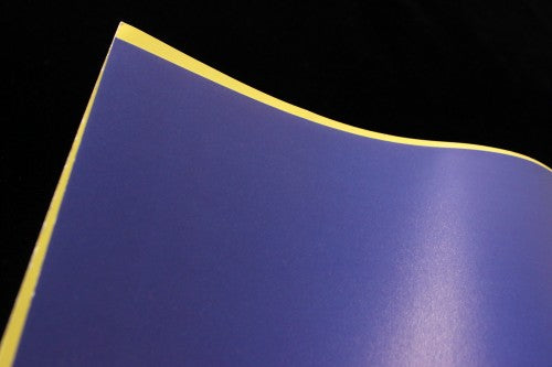
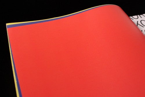
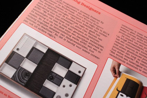
A page of yellow, a page of blue and then a page of red contrast the neighbouring black and white of the intro pages: arresting slabs of colour there to simply stimulate the eyes (above). Colour as contrast is an important motif in Kwintessens: a section spotlighting design studios has a pink background and red font, a combination that blatantly jars with accompanying photographs so that the products stand out boldly against the tinted page (below).
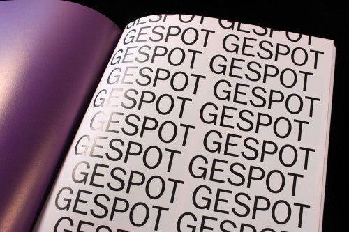
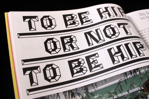
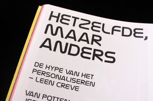
Titles within the magazine are theatrical typographic displays, with letters streamlining down pages like alphabetical confetti (above). Each feature of the publication has its own matching font, used not only for the spread’s title and sub-titles, but also for the page number and section information (below). This format allows for typographic experimentation and visual variety, whilst still retaining a strong sense of coherence throughout.

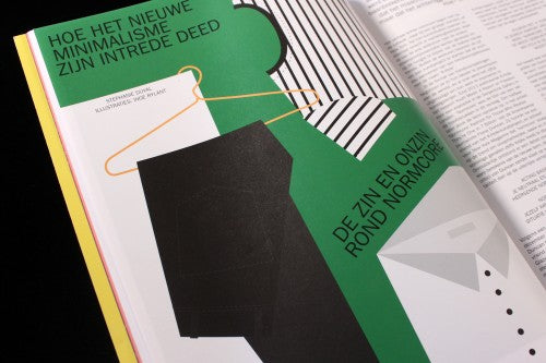
A feature on normcore makes good use of illustrations by Inge Rylant (below). This spread supplements arresting graphic visuals for the flamboyant type-faces used elsewhere in the magazine – a decision that makes sense considering the simple aesthetic of ‘normcore’ that is being explored in the text.
The design of Kwintessens is engaged in a playful visual dialogue with the content being showcased. In many ways, the publication is a celebration of the possibilities of design, a magazine-y ode to colour and font. Each issue is designed by a different studio – this one comes from Laura Bergans.
Review by Madeleine Morley


