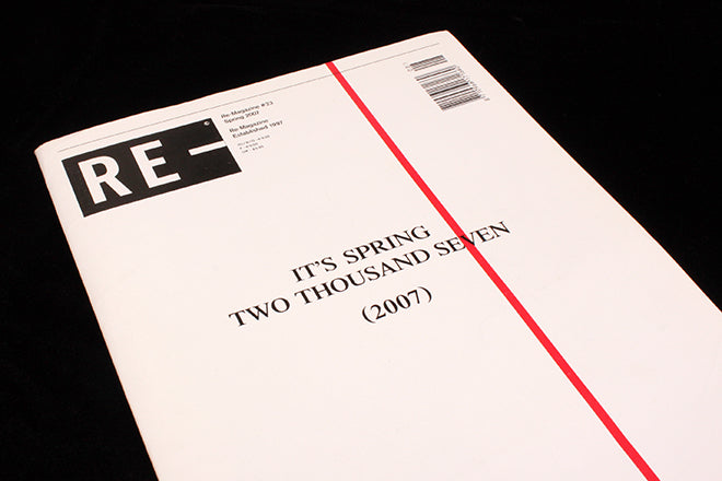
Re– Magazine, #8, 2002
For the past five days I’ve taken over ZEITmagazin’s Instagram feed, posting three magazine covers each day: one from the past, one from now, one for the future. You can see the full set of covers here.
With today’s final set I started with Re– Magazine, an experimental publication that ran from 1997–2004. Launched by Jop van Bennekom as part of his design studies, he wrote, designed and photographed everything for the first few issues before building a team to help with later ones. The earlier issues set the tone; the run of 15 issues form an extraordinary series of individual magazines that shift theme and approach, using the visual and verbal language of magazines to create different and distinct experiences that are both intelligent experiments in storytelling and meditations on the art (and science) of magazine-making.
Successful magazines create a world of there own, with their own rules and parameters set within more established expectations that dictate what is ‘normal’. This is usually set to the service of entertainment, information or selling; with Re–, van Bennekom created a series of worlds that ignored ‘normal’ and instead explored the very form of ‘magazine’ and in doing so established many of the elements that he later applied to Butt and Fantastic Man: the systematic use of a small set of fonts, little page decoration beyond occasional column rules, small text interventions and footnotes. The design is built from the content, not the other way round.
Issue eight of Re– was the key issue for me; numbered as issue 23 and dated five years after its actual publication date, it broke conventions from the very start. At first glance it seems the same as other issues – A4, bound – it was instead a series of A3 sheets folded in half and loosely bound by a red rubber band (now missing from the copy shown in the images above). This band is echoed throughout the issue by the vertical red stripe through all the text pages.
Each A3 sheet has content on one side and a page-by-page description for that content on the reverse, emphasising the loose-leaf nature of the pages and loading what might otherwise by standard page signposting with added importance. Several written pieces are broken by single images and sets of commissioned images. These pieces of writing concern ideas of the future. One chronologically lists historical assumptions of what the future would hold, as seen by philsophers, scientists and artists, ending with the publication of a book of Nostradamus's predictions for the 21st century. Another contrasts this seriousness with a list of mundane memories of travel to different countries, weaving in world events such as the fall of the Berlin Wall.
It’s an extraordinary piece of publishing that remains one of the most challenging and thrilling pieces of editorial experiment made in recent times. It’s influence can still be seen in Fantastic Man and all the projects van Bennekom has published since (The Gentlewoman, The Happy Reader, COS magazine etc) but it has had a broader influence too, encouraging others to experiment.
When you self-publish a magazine it makes sense you push the boundaries and try things your way. Why else do it yourself?


