

Revue Faire #30
Contemporary type foundries have had to adapt to the digital world just as the publishing and music industries have.
This new issue of French graphic design magazine Revue Faire is an overview of one foundry, Lineto, and their intelligent interaction with culture and society as they produce and promote their typefaces.

New typefaces have traditionally been promoted using printed speciman sheets. Lineto (the name refers to a coding command used in creating digital fonts) have adapted this tradition to reflect their experimental approach to creating typefaces. Alongside pamphlets, posters and other printed items they’ve produced animations, Letraset-style rub down letters and 3D items.

Launched in 1994 by graphic designers Cornel Windlin and Stephen Muller, from the start Lineto was more of a collaborative venture than a hardnosed business project. The two like to describe LineTo as a distribution platform rather than a type foundry – note the link to the world of digital music – and their interest in mass culture showed itself in playful fonts based on Lego bricks, the Rubik’s Cube and Pez sweets.

Over the years, their typefaces have become more practical in their application – magCulture’s sans serif is one of their designs, LL Circular – but their approach remains the same.
All of which provides this issue of Revue Faire with a rich foundation to work from, since it shares many of the ambitions of LineTo.

Launched by two French designers, Sacha Léopold and François Havegeer, in 2017, the magazine takes one subject every issue. The main body is usually a single longform essay (reproduced in French and English) and the design adapts to tell the story of the subject in question.
The selected subjects are not always obvious ones – issue 29 examined how the Nazis manipulated popular culture, in particular Dance, while another maps the use of the acronym ACAB (all cops are bastards).

The freedom enjoyed by its editors and writers to examine very particular subjects in great detail is rare today – Revue Faire is a vital addition to design publishing.
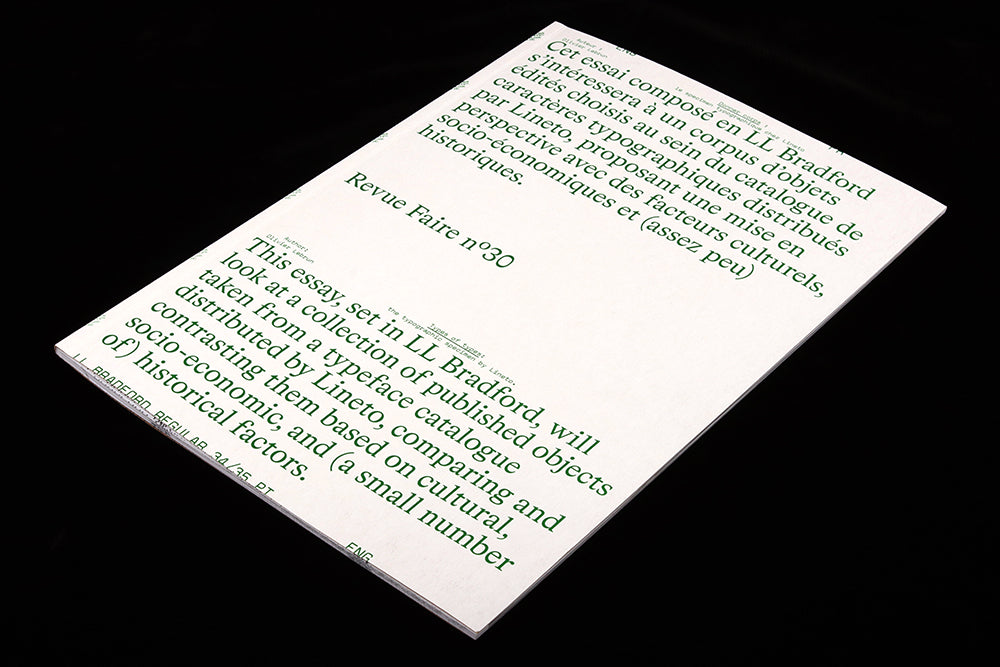
As issue 30 explains on its cover, ‘This essay, set in (Lineto’s) LL Bradford, will look at a collection of published objects taken from a typeface catalgue published by Lineto, comparing and contrasting them basd on cultural, socio-economic and (a small number of) historical factors.’

The following 68 pages features a visual archive of promotional work in the from of books, posters, pamphlets, letter transfers, print ads, and video stills as well as inflatable structures and bootlegs of logotypes, all flowing through the pages alongside a bilingual text from Oliver Lebrun.
It works as a record of Lineto’s work to date and as a case study in how design and designers develop. The original desire to experiment has shifted slighty as the reality of a more useful typography has created a demand for access to their products. Their library will be familiar to any contemporary graphic designer.

In a pleasingly appropriate response to the issue, the Lineto team are themselves now reveiwing their archive; as I write, their website is showcasing the original video animation of their font LL Biffa used as train car graffitti (detail from the magazine, above), and they’re promising more looks back.
This issue of Revue Faire is the perfect one to start your relationship with the magazine. As its name alludes, it’s a magazine about doing as much as about thinking. The intelligent essay is enhanced by the clever art direction and design, the visuals more than just decoration. This is what makes it so satisfying – the thoughts are matched by action on the page.
Editors: Sacha Léopold and François Havegeer
Design: Syndicat