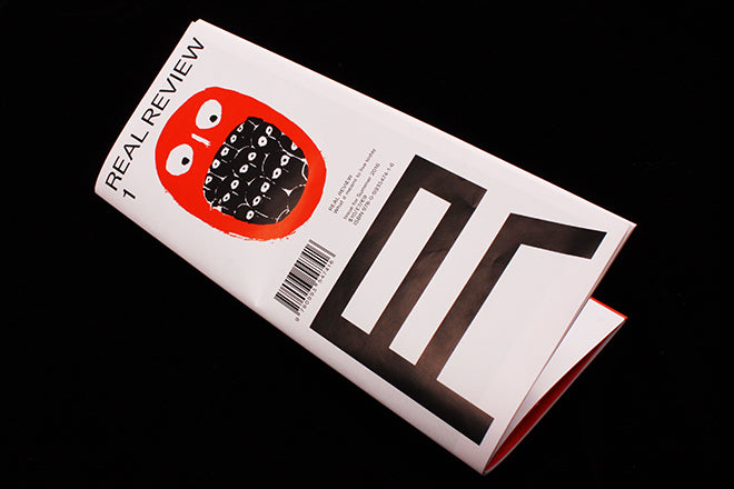
Real Review #1
London’s newest architecture title The Real Review has an all-star team of minds behind it: it’s sleekly art directed and designed by OK-RM, thoughtfully edited by architect and critic Jack Self , is in media partnership with Archdaily, and it includes written contributions from the likes of Sam Jacob and Oliver Wainwright. With its definitive and enviable tagline of “what it means to live today”, The Real Review is crisp and lucid, and it gracefully tackles the question of what a review of the 21st Century should look, read and feel like.
In his editor’s letter, Jack notes how it is ‘the financial models that once supported magazines that have become problematic, not the concept of the magazine itself.’ A long list of names printed alongside the masthead then nods to the very contemporary way that The Real Review achieved its funding, namely a triumphant Kickstarter campaign that was pushed on several architecture blogs and platforms. It was mid-campaign that Shumi and Jack won the competition to curate the British Pavilion at this year’s Venice Biennale: they’ll now be turning their curatorial eyes beyond editorial, but The Real Review provides an intriguing glimmer into the pair’s general thinking and approach.
Firstly, the design – the magazine’s architecture – makes impressive use of space. On the second episode of our magCast podcast, Delayed Gratification’s editor Rob Orchard noted that the size of magazines are probably going to start changing to fit elegantly through the slit of letterboxes. This functional design would make more sense in terms of the current way that independent magazines are distributed – which tends to be hooked to subscriptions and therefore mail services. The Real Review seems to have taken this elegantly into account: it’s a wide magazine disguised as a tall and thin one.
When it drops onto your front door stoop, the thin shape is deceptive – like the cover’s scruffy illustration of a single head that has many other heads inside it, there’s more to The Real Review then you first think. The spreads fold out and allow for a lot of inventive play when it comes to column sizes and numbers (above), so the pace and length of articles can be smartly manipulated, and hidden visual content also surprises when you unfold certain pages (below).
The Real Review fills its myriad of spaces with a variety of conceptual and contextual takes on contemporary architecture, or works that in some way make use of place. Editor Jack determines the ways that you should interpret architecture and judge whether it’s good or bad; Edwin Heathcote reviews graphic novel Here, a book that spans centuries of history but which never moves away from a single geographical spot; and Supervoid studio explore the effects of hyper-connectivity (below), for example. Photographs of Kim Jong-Il’s monuments in North Korea, accompanied by an essay by Oliver Wainwright, are a highlight (also below)
The Real Review intelligently celebrates and revitalizes the format of the review, a kind of criticism that is often underappreciated but which, as Jack and Shumi emphasize, is vital because of its “ability to encompass an entire epoch”.


