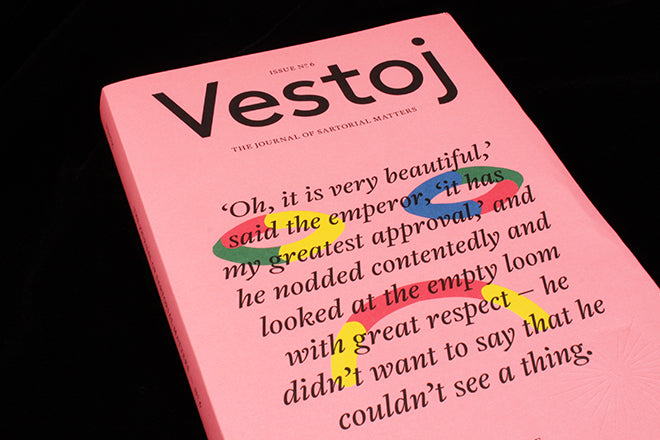
Vestoj #6
What I love about Vestoj, the infinitely impressive journal of sartorial matters, is the way that each inch of the publication has been crafted to subtly but evocatively convey its theme. You can draw incredibly rich meaning from every typographic and graphic detail, and you can read the editorial design almost like a painting. For the latest theme ‘On Failure’, Vestoj’s design continues to succeed, and it does so from the very start, making the most of its new larger format.
The magazine always has a jacket, and in the past, the designers have used it as a kind of visual metaphor – creating a link between the idea of a book jacket and a jacket that you can actually wear (see our review of issue five). The nude pink color of issue six’s front cheekily resonates with the quote from Hans Christian Anderson’s ‘The Emperor’s New Clothes’, which splashes jubilantly across the front. It’s like the magazine is wearing nothing but skin. This allusion to Anderson’s fairy tale is in itself particularly audacious for a magazine about fashion, but it chimes with Vestoj’s manifesto and promise to always ‘challenge the status quo’. Throughout the entirety of issue six, the Vestoj team continue to lay the truth bare through a combination of word and image.
The colourfulness of the sad smiley on the cover conveys a contrasting feeling of joy to the reader, and this juxtaposition is important. In her editor’s letter, Anja Aronowsky Cronberg considers the idea that in our scramble to get ahead, we often miss opportunities to grow and learn. She suggests that failure can be a good thing and we should spend time looking at our failures; I think that the rainbow colour of the sad face reflects the positives that Anja believes can come from looking at mistakes. Also note the line that emphatically reads “I err, therefore I am”, which is printed on the back of the magazine (below).


 Another way that Vestoj visually embodies the theme of ‘failure’ is in their use of spacious index sections. These largely blank text boxes are plonked into the centre of text columns (above), and their strange emptiness creates a sense that something has been left out. The idea that something is missing chimes with the Emperor’s crucial lack in Anderson’s famous tale. Sometimes, the blank box falls at the top of columns and melds with the gap for the header; this makes the text feel like it’s being un-zipped (also above).
 Editorial design aside, Vestoj is also immaculately put together in terms of its words. Its stories are strange, smart and fantastically varied, both vigorously academic and hilariously tongue-and-cheek. In issue six, there’s a piece on the failed attempts at getting rid of high-heeled shoes in history, an essay and photo-story about the clothing of patients in asylums (above), and a series of interviews conducted over Craigslist where people have shared anecdotes about major clothing mishaps. A photo series about where clothes go after you’ve thrown them in the recycling bin is also strangely poignant (below).

 Title pages for sections make strong use of narrative photography (above), as do the provocative academic essays (below). I also love how a story about a drycleaners in New York, which meticulously investigates how to deal with different stains, is printed on faded brown paper and includes its very own stain in the centrefold (also below). Vestoj don’t overdo these little design tricks; they’re subtle enough not to detract from the overall elegance of the publication.


If you agree with editor Anja’s concept about failure, then after reading this magazine you will wonder how many times the Vestoj team have had to fail to make something that’s so brilliantly right. Here’s a way to be both smart and stylish, and a fantastic example of how editorial design can be used to maturely elevate and strengthen the themes of a text-heavy publication.
Design: Studio Blanco

Buy this issue from the magCulture online shop


