

zweikommasieben #12
We last mentioned Swiss club culture mag Zweikommasieben a couple of issues ago, noting its strong identity based on the ‘ruthless application of a simple idea’. Since then the stark black issue 11 quickly proved a solid seller at the magCulture shop, and now the twelfth edition has arrived in a new large format.
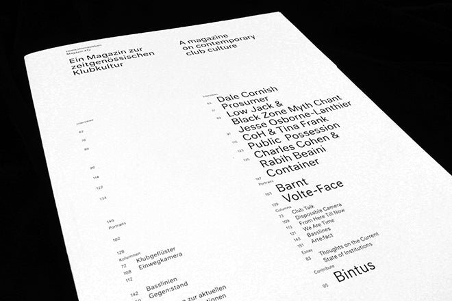
Format aside, it’s very much the same magazine: typographically tight and relying on another super-pure grid system, albeit far simpler than that used in recent editions. But the larger page means more space and definition between the two languages (German and English), even with a single typeface used in only three points sizes (headline text and footnotes).
 Two features add vital splashes of exhuberence; the cover peels back to reveal open binding (above); and the 164 pages are ruthlessly divided into four sections, indicated by die cut tabs (below): Images, Quotes, Texts and Ads.
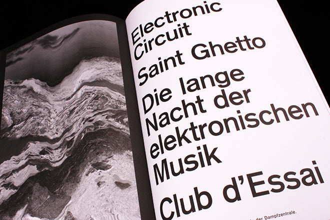
 It’s a brave approach. Images and quotes, even ads, are generally seen as useful tools to break up pages of text. Here the elements are entirely separated and cross-referenced only by page number.
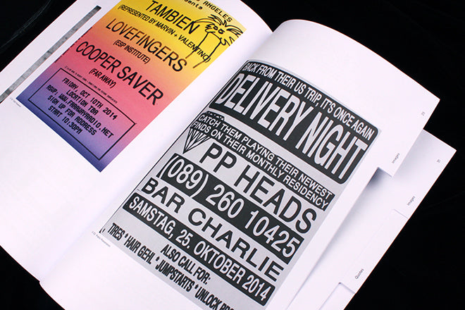
Images…

…quotes…

…texts…
…and ads.
It’s brave, but it works. Structure is an essential part of all magazines, and its strangely satisfying seeing such raw editorial structure on show – the tabs are the killer feature, making the structure explicit. It’s another simple idea ruthlessly applied, and again entirely appropriate to the content.
Editor: Remo Bitzi
Design: Kaj Lehmann, Simon Rüegg & Raphael Schoen

Buy this issue from the magCulture online shop