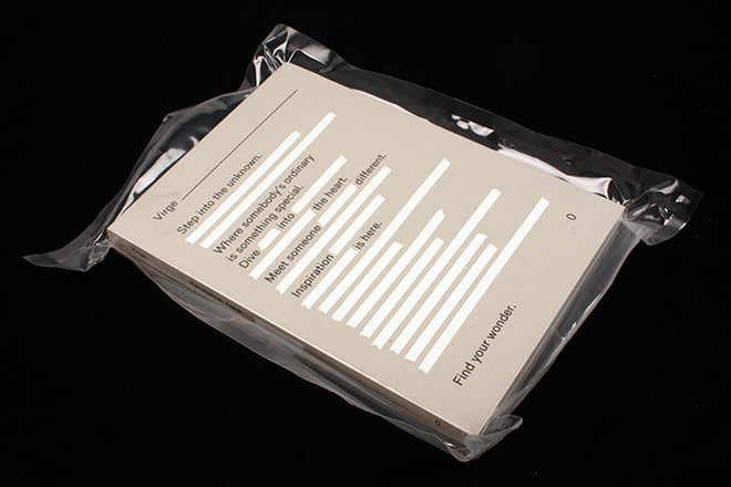
Virge #1
Not yet two weeks into the new year and we’re already inundated with new launches.
One lovely example is this new travel magazine from Japan. Virge weighs in at a hefty 372 pages, and for this first issue covers the Kanagawa Prefecture, an area just south of Tokyo. ‘What you won’t find here are popular landmarks,’ editor Hiroshi Kamada explains in his introduction. Instead, he highlights favourite spots indentified by locals, and there are many, many such spots featured, each accompanied by a brief biography of the person who proposed it.
Hiroshi attributes this approach to a month he spent touring Europe – he had three rules: no guidebooks, no hotels and no prior research. If used, his magazine will encouarge the reader to break these rules of course, but the underlying ethos remains and is emphasised by his request that users keep the places Virge recommends private.
The volume of research is impressive, but there are several creative details worth highlighting too. First, the issue comes in transparent vacuum-packed plastic that exaggerates the brick-like format (top). Text on the cover (above) is a redacted version of a longer intro text on the first page of the issue, a nice touch that hints at discovery inside the pages.
The design is crisply modern, a single sans typeface in a repeated range of five sizes and plenty of space and floating images. It’s carefully planned and paced but the winning element is the hand-drawn underscores and ‘dirt’ marks used for emphasis as needed (the marks top right on the front cover are deliberate too). This is a difficult thing to manage well, but here it is handled perfectly as these examples (above) show. Delicate but effective, it’s these little details that bring the pages to life.
Editor: Hiroshi Kamada
Art direction: Saeka Shoda/Deltro Inc.


