Zeit Magazin – part 2
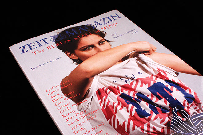
As Madeleine wrote here earlier today, to fully enjoy the weekly Zeit Magazin you need to read German. But there is an occasional respite – the biannual International Issue. The Spring–Summer 2016 edition has just been published, and it’s in perfect contrast to the latest German issue we shared this morning.
Each International Issue is a best-of compilation from recent and archive editions of the weekly, the stories reformatted to make a consistent, single magazine using the same basic design elements as the weekly. Across 260 pages we get a good insight into what we’re missing: a strong mix of art, culture, celebrity, reportage and regular sections. All carefully refined and filtered to reflect the magazine’s ‘Berlin State of Mind’ and presented using the weekly’s usual classic, clean typographic approach.

For this issue, the art team (overseen by Mirko Borsche, led by art director Jasmin Muller-Stoy) have adopted a simple headline technique that runs through all the interview features. The name of the interviewee is displayed in a graphic pattern across a full page using the magazine’s favoured Tiemann typeface in capitals (above and below).
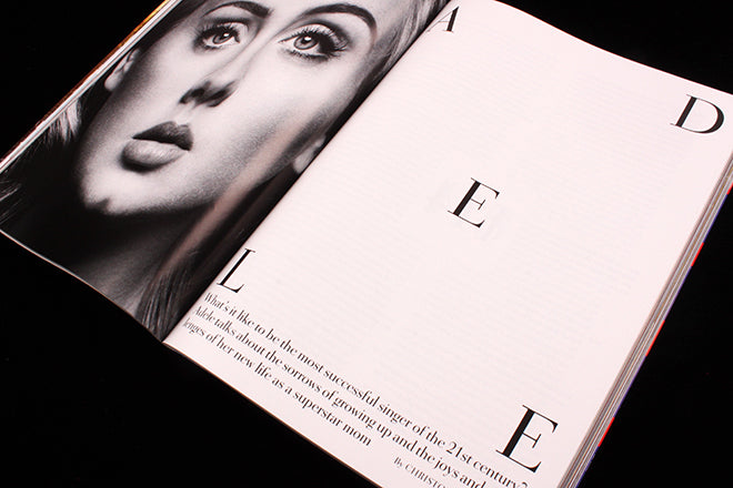
Such clean, elegant typography is typical of the magazine; in the Adele feature that central ‘E’ of the headline is echoed by large page numbers sitting in the centre of the text on the following pages (below). This is the familiar, clean design against which this week’s special issue (and other occasional departures) is in complete contrast.
But what makes Zeit Magazin, in both versions, so special is the way it mixes high seriousness with complete silliness. The parts I really enjoy are the regular sections and columns, some of which are compiled in the International Issue to make longer stories. Their ‘I have a Dream’ column usually features a brief thought on that subject from a personality in the news; but sometimes they invite fictional characters to offer their dreams, and treat them absolutely seriously. Together they make a great set: Charlie Brown and Snoopy (‘When I wake up from my favourite dream, I have this great feeling of having made it…’), Kermit, Miss Piggy (below) plus lesser-known German characters (Bernd das Brot?).
Contributors are always spot-on; Juergen Teller is a mainstay (I love his dog staring at the butcher’s shop, below) and other photographers include Hanna Putz, Nacho Allegre and Peter Langer. Illustration gets plenty of space too, and not just in the special issues. The International Issue has several illustrated stories including a series about Facebook by Pieter van Eenoge and a watch story – always a tough thing to successfully place in a magazine – drawn by Christina Gransow.
Each International Issue ends with a round up of front covers on a single theme from the 40-year archive of Zeit Magazin, in this case wildlife covers. That one item perfectly sums up what’s special about this mag: it runs to its own agenda – you will search in vain for restaurant review columns or car test drives, the lifestyle mainstays of UK supplements. Of course it is contemporary and timely, but it allows itself huge licence to wander and wonder, doing what it wants to do. A rare thing in newspaper magazines today.


